Create Travel Map with Python and PyGMT
I spent the last year in Finland, but in reality, I was traveling between Finland and the southern part of Poland. The longest distance was about 1600 km by car. At the end of 2022, I have prepared the infographic for my Instagram account with points where I have been for more than one hour along the route:
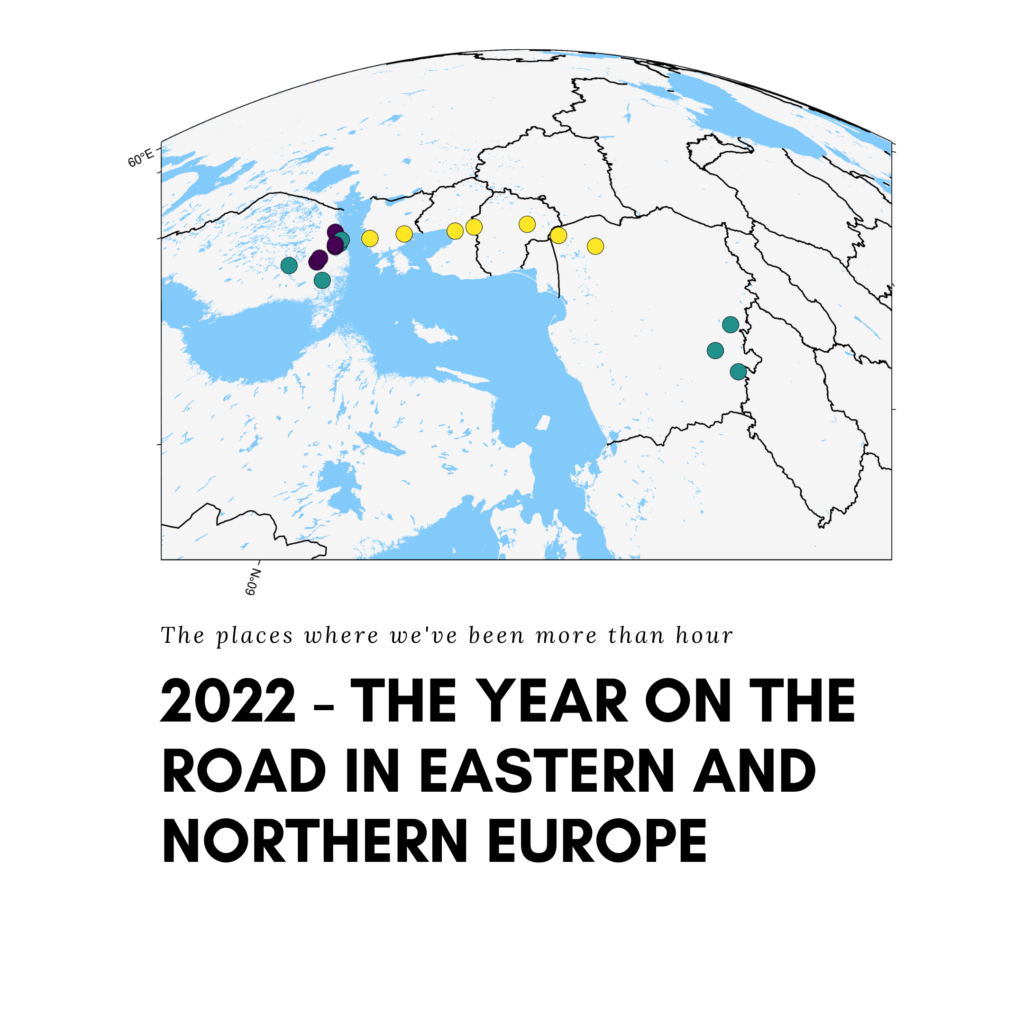
Points color has its meaning:
- green points – places of living,
- violet points – sightseeing,
- yellow points – resting places.
The mapping wasn’t straightforward. There were two problems:
- the canvas width-to-height ratio should be as close to one as possible, because of the square posts on Instagram,
- the points are dispersed primarily on the south-north axis, making it challenging to produce a near-square map.
Using GeoPandas for this task… is not the best idea. There are better options, for example, the pygmt mapping package. I have written about it once in the article Leave GeoPandas and Create Beautiful Map with PyGMT. We will go step-by-step through how to create this map. You may check Jupyter Notebook and dataset in the repository here: Github.
Installation
First, you must have Python and preferably conda installed in your system. You may consider using Google Colab or a similar cloud service if you wish so. Then you need to install only two packages (three if we count notebook in the local environment):
pandaspygmt- (optional)
notebook
To install those packages with conda run in the terminal:
conda create -n map python="3.10"
conda activate map
conda install -c conda-forge pandas pygmt notebook
You may install them with pip too, but remember to create a virtual environment for it.
Data
You should have a dataset with point coordinates. My dataset is a simple CSV file, here’s a sample from it:
| IDX | Place | Country | Reason | Latitude | Longitude |
| 0 | Lomza | PL | Travel | 53.176389 | 22.073056 |
| 1 | Vantaa | FIN | Living | 60.294444 | 25.040278 |
The most important columns are:
- Latitude and Longitude: to place our points on the map,
- Reason: to color points according to a category from this column.
Data is stored in CSV, the file is available in the article’s repository.
Coding & Mapping step by step
We have tools and materials for work, then let’s start coding! Open notebook and import core packages:
import pygmt
import pandas as pd
With pandas we can load a dataset from a CSV file:
df = pd.read_csv('data_locs.csv', sep=';')
Filename (data_locs.csv) is a path to the file I defined, but you must change it if you have a different file to work with. Maybe you’ve realized that additional argument sep (separator) with a semicolon symbol is passed. It is an artifact from my dataset created in the Polish version of Excel, where commas are used to separate decimal numbers. In the USA, and every programming language, you use a dot to describe a half like that: 0.5, but in Polish and a few European languages that I know, a comma is used instead, and a half is written like that: 0,5. That’s why CSV files cannot be comma-separated, but semicolon-separated or tab-separated. It is not important for our analysis, I’m pointing it out to clarify this – possibly – strange separator.
We have data prepared, thus we can build a canvas for analysis. First, we should define the boundaries of a region of interest:
region = [
    df.Longitude.min() - 1,
    df.Longitude.max() + 1,
    df.Latitude.min() - 1,
    df.Latitude.max() + 1,
]
And we can jump into plotting:
fig = pygmt.Figure()
fig.basemap(region=region, projection="M15c", frame=True)
fig.coast(land="black", water="skyblue")
fig.plot(x=df.Longitude, y=df.Latitude, style="c0.3c", fill="white", pen="black")
fig.show()
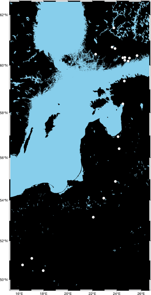
And it is not something that we expected! The map is on planar projection and will be distorted if we try to shrink it along the North-South axis. The other problem is that our points are no different from each other, but we have prepared categories in the Reason column that we might use. We start from the second problem and return to squaring a rectangle in the next step.
To paint points according to a category of the Reason we must change this column type and perform an operation known as label encoding. We can assign integer values to categories from categorical columns, it is a valuable property for machine learning purposes but also for data visualization. It can be done with two lines of code in pandas:
df['Reason'] = pd.Categorical(df['Reason'])
df['Val'] = df['Reason'].cat.codes
And with that, we can make our map more interesting:
fig = pygmt.Figure()
fig.basemap(region=region, projection="M15c", frame=True)
fig.coast(land="black", water="skyblue")
pygmt.makecpt(cmap="plasma", series=[df['Val'].min(), df['Val'].max()])
fig.plot(
    x=df.Longitude,
    y=df.Latitude,
    fill=df['Val'],
    cmap=True,
    style="c0.5c",
    pen="black",
)
fig.show()
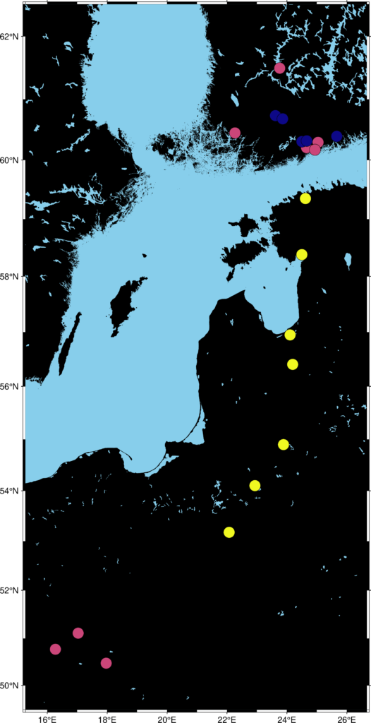
The second map looks more decent. Decisions or analyses could be made based on the point patterns and their classes. But it isn’t a map that might be posted on social media. The problem of the width-to-height ratio still exists. The solution is to change the projection from planar to spherical and the angle of view! After a short time, we can create an entirely different map:
fig = pygmt.Figure()
fig.basemap(region=region, projection="G12/55.5/22c+a90+t40+v60/60+w0+z1000", frame=True)
fig.coast(land="#F5F5F5", water="#82CAFA", borders='1/1p')
pygmt.makecpt(cmap="viridis", series=[df['Val'].min(), df['Val'].max()])
fig.plot(
    x=df.Longitude,
    y=df.Latitude,
    fill=df['Val'],
    cmap=True,
    style="c0.5c",
    pen="black",
)
# fig.savefig('our_travels_2022.png')
fig.show()
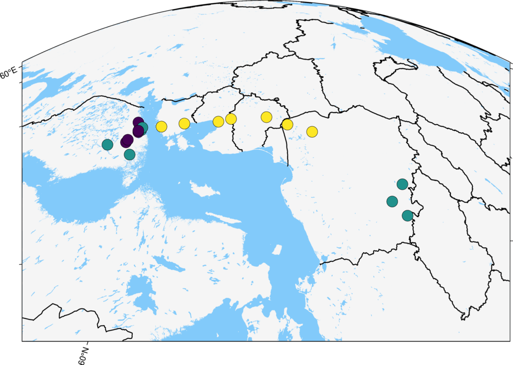
And with this map, we can go posting on social media.
Do you want to know more?
Here are additional resources that you might use to understand better what happened with the map:
- For the first map, the basic plots in pygmt: https://www.pygmt.org/latest/tutorials/basics/plot.html#sphx-glr-tutorials-basics-plot-py
- For the second map, coloring the points: https://www.pygmt.org/latest/tutorials/basics/plot.html#sphx-glr-tutorials-basics-plot-py
- For the third map, the projection that has been applied: https://www.pygmt.org/latest/projections/azim/azim_general_perspective.html#sphx-glr-projections-azim-azim-general-perspective-py
And finally, why by car instead of a plane?
Here’s why: