Data Science: Leave GeoPandas and Create Beautiful Map with pyGMT
The typical day of a scientist working with spatial data always ends with a map. It doesn’t matter if those maps are created for reports, articles, or just for fun. Spatial information needs to be displayed on the map. Fortunately, Pythonistas have GeoPandas, and we can quickly show our maps, just like this one:
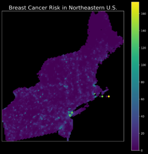
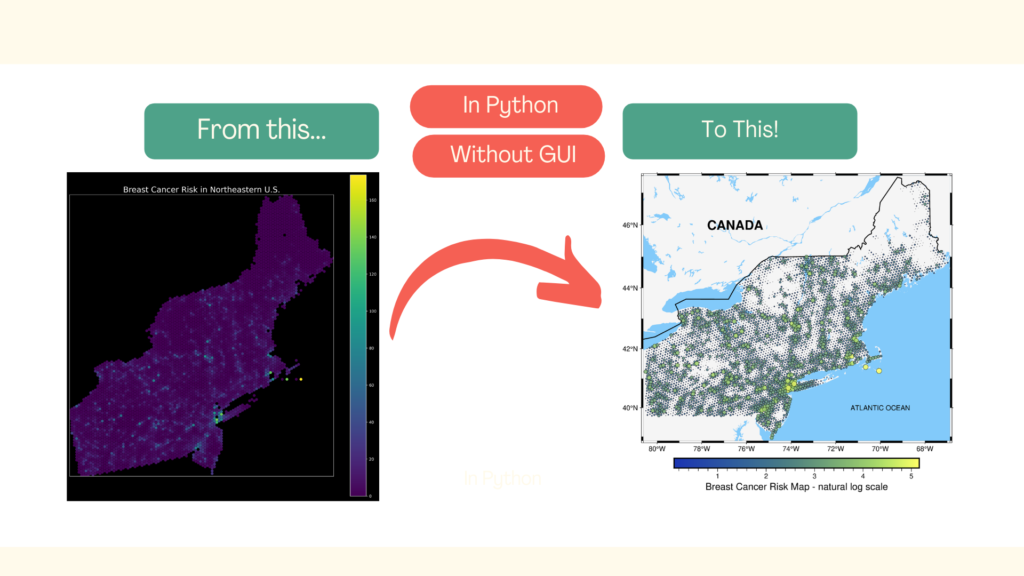
Ugh! So yes… This map is not exactly beautiful and not exactly clear. In summary, it’s not exactly a map, maybe some kind of a colorful blot. Yes, it could be better, but it’ll require a lot of tedious work! There is another option – with the Python package pyGMT and just a few lines of code, we can transform our ugly plot into a map that can be shared with other people:
We will learn how to do it in this article. It is divided into three sections:
- Data and environment,
- Data Exploration and Basic Views,
- Map development.
What are the main takeaways from this article?
- We will be able to show data on a clear and beautiful maps,
- We will learn how to transform data for visualization and mapping.
Data and Environment
We must be sure that we start from the same position. The one condition is to have a similar programming environment. I assume that you’re familiar with the conda package management tool. If you don’t know what it is, then check conda here and install it in your OS. It doesn’t matter which type of installation you choose (Anaconda or Miniconda).
If our conda installation is successful, we see in terminal keyword (base) at the beginning of the line. We are ready to set up our Python environment. It can be done with one command:
conda create -n pygmt-env -c conda-forge pygmt numpy geopandas matplotlib notebook
This command has done two things:
- It created container
-nnamedpygmt-env. - This container installed packages
pygmt, numpy, geopandas, matplotlib, notebookwithin it. Conda downloaded those packages from the-cchannel namedconda-forge.
It is crucial to install those packages within the virtual environment. It could be conda or Python VirtualEnv because we install GDAL along spatial packages and it may corrupt some applications if installed in the system-wide environment. If you have installed QGIS or other GDAL-depended packages in your operating system, then they could be damaged. If you’re not sure about the installation, write a comment below, and we will go through it in more detail.
Hopefully, we have configured the environment without surprises. We can activate it and start our exercise. Go to the directory where you want to run your project, open the terminal in this folder and activate the environment with the command:
conda activate pygmt-env
If you see (pygmt-env) instead of (base) at the beginning of the terminal line, everything works fine. The last step is to download the exercise dataset. It is available here: https://github.com/SimonMolinsky/pygmt-article-2021-01. It is a shapefile named smoothed_output.shp. You can download only data, without code notebook, from the archive data.zip. It is here: https://github.com/SimonMolinsky/pygmt-article-2021-01/blob/main/data.zip. To do it, click on the Download button in Github website. Move data into a directory where you have started your project. Then return to the terminal with activated pygmt-env and type:
jupyter-notebook
Press Return (Enter), and we are ready to go! Create new notebook and follow the code along this tutorial. Each code part is a single cell within this notebook. If you feel overwhelmed you can check solution in the repository with data.
Data Exploration and Basic Views
In the first cell of notebook type:
import pygmt
import geopandas as gpd
import numpy as np

import matplotlib.pyplot as plt
plt.style.use("dark_background")
What is the purpose of each package?
pygmtis a Python wrapper around GMT mapping tool – we will use it to create a beautiful map!geopandasis a core tool of a spatial analyst, and we can use it for spatial data exploration, transformation, basic analysis.numpyis a linear algebra package, but we will use it to transform our dataset.matplotlibis a core plotting library in Python. We won’t use it for maps but histograms when we explore data.
The last line sets plotting styles in our notebook. It will affect figures plotted with matplotlib and the map plotted with GeoPandas.
Press Shift+Enter and wait until the package’s content is loaded. (Loading and data processing in Jupyter Notebook is presented with an asterisk character on the left side of a cell). In the next cell we load our dataset. It represents the Breast Cancer Risk (Incidence Rate -> number of new cancer cases per year per 100,000 people in a region). If you want to know more about the dataset, you can read it here. For this article, we will use only geometry and one column from the loaded table.
data = gpd.read_file('smoothed_output.shp')
data.head()
Sample records from the data table are:
| id | reg.est | reg.err | rmse | geometry |
| 25019 | 0.1 | 7.6 | 18.5 | POINT(2117322.312, 556124.507) |
| 36121 | 5.4 | 6.8 | 27.8 | POINT(1424501.989, 556124.507) |
We have five columns but we use only reg.est values and geometry coordinates. Before plotting we should take a look into reg.est statistics:
data['reg.est'].describe()
| count | 4960 |
| mean | 5.756108 |
| std | 9.794106 |
| min | 0 |
| 25% | 0.943172 |
| 50% | 2.729134 |
| 75% | 6.517619 |
| max | 173.5745 |
We have 4960 records. The third quartile is about 6 (cases per 100,000 people per year for a given area) and the maximum value is 173, so we may expect multiple values around zero and a long tail. It is an example of the real-world phenomenon with the Poisson Distribution of rare events occurring independently over a specific area and time. We can plot a histogram of values and check if our assumptions over data distribution are correct:
plt.figure(figsize=(15, 5))
plt.hist(data['reg.est'], bins=30, alpha=0.85)
plt.title('Histogram of the relative risk of having a breast cancer in Northeastern U.S.', size=20, pad=5)
plt.xlabel('Relative Incidence Rate - Breast Cancer', size=12)
plt.show()
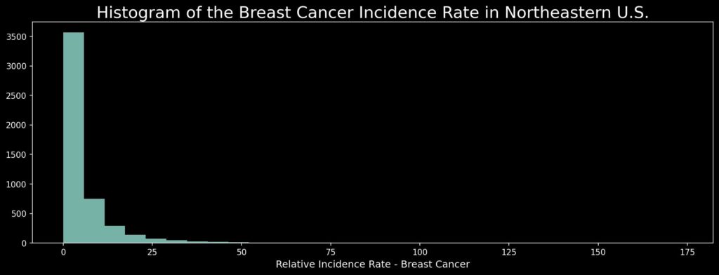
As we see, most values oscillate around zero. It means that cancer is a relatively rare event – good for us. From a technical point of view, it is not a simple task to present values dispersed over this range. We will come back to this problem later.
We know the general distribution of cancer rates; now, we will uncover the spatial distribution of those. GeoPandas has .plot() method to show spatial data. We style it slightly by removing margins and ticks and take a look into data:
This figure may be informative, but it is ugly and rather hard to read for non-specialists. It is especially hard to find any patterns and hot spots in it. A few things could be done better, and we will make it better with pyGMT.
Map Development
Working with spatial data has its rhythm. We are always required to do something with a projection at some step, and this time we can’t avoid it too. We need to know our data Coordinate Reference System to set map bounds for the mapping. The map canvas has its projection, and we must unify the data projection with the canvas projection. We will draw our map on Mercator projection, where coordinates are represented by degrees. Let’s start with the analysis of the data projection. We can check its bounds with the .total_bounds parameter of the GeoDataFrame object:
bds = data.total_bounds
print(bds)
[1277277.6705919 196124.50679998 2255886.37686832 1241124.50679814]
As we see, it’s a metric representation. Therefore, we need to transform our projection to Mercator projection. To be sure that data has a different CRS, we can use the .crs parameter:
print(data.crs)
<Derived Projected CRS: PROJCS["Lambert_Conformal_Conic",GEOGCS["NAD83",DA ...>
Name: Lambert_Conformal_Conic
Axis Info [cartesian]:
- [east]: Easting (metre)
- [north]: Northing (metre)
Area of Use:
- undefined
Coordinate Operation:
- name: unnamed
- method: Lambert Conic Conformal (2SP)
Datum: North American Datum 1983
- Ellipsoid: GRS 1980
- Prime Meridian: Greenwich
Yes, it is a projection that doesn’t fit our map. Lambert Conformal Conic projection is used to present maps of mid-latitudes of the United States, and it was used with this dataset to analyze variograms for the Kriging interpolation.
Transformation of CRS in GeoPandas is very simple. We use method .to_crs(crs) for it:
data2 = data.to_crs(crs='merc')

bds = data2.total_bounds

region = [
    bds[0] - 0.1,
    bds[2] + 0.1,
    bds[1] - 0.1,
    bds[3] + 0.1,
]

print(region)
[-80.61423127996099, -66.88249508664613, 38.856652763089464, 47.516422721628444]
Now our extent is valid. We’ve made it slightly larger to create a margin from the extreme points to the canvas frame. With an analysis region set, we can start mapping with pyGMT. First, we plot clean canvas:
fig = pygmt.Figure()
fig.basemap(region=region, projection="M15c", frame=True)
fig.coast(land="black", water="skyblue")
fig.show()
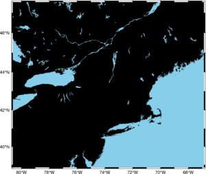
Even the clean canvas is pretty! What happened? In the first line, we’ve set up a figure, then we’ve drawn a canvas with the fig.basemap over a specific extent given by the region parameter and the projection. Parameter frame sets a pretty frame around a map. The method fig.coast draws land and water, and we can select the color of those features. When our baseline map is done, we can draw points on it:
fig = pygmt.Figure()
fig.basemap(region=region, projection="M15c", frame=True)
fig.coast(land="black", water="skyblue")
fig.plot(x=data2.geometry.x, y=data2.geometry.y, style="c0.05c", color="white")
fig.show()
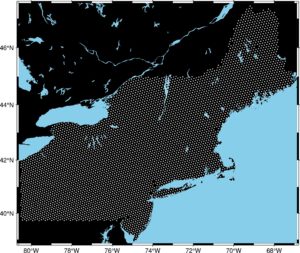
We set a new layer on our map with points representing the Breast Cancer Incidence Rate sampling areas. Method .plot() takes multiple arguments:
xis a longitude,yis a latitude,styleparameter was set to: circle of 0.05 centimeter size,color– points are white.
This figure is not very informative, and we haven’t included any information about the Breast Cancer incidence rates. How to do it? We will work with a plot style. The size of circles should be dynamic and depend on the incidence rate; color should bring some information too. That’s why we make a colormap from our data and plot a color bar.
# Set size and color of points

ds = data2['reg.est']
fig = pygmt.Figure()
pygmt.makecpt(cmap="imola", series=[ds.min(), ds.max()])
fig.basemap(region=region, projection="M15c", frame=True)
fig.coast(land="black", water="skyblue")
fig.plot(
    x=data2.geometry.x,
    y=data2.geometry.y,
    size=ds / 200,
    style="cc",
    color=ds,
    cmap=True,
    pen="black",
)
fig.colorbar(frame='af+l"Breast Cancer Risk Map"')
fig.show()
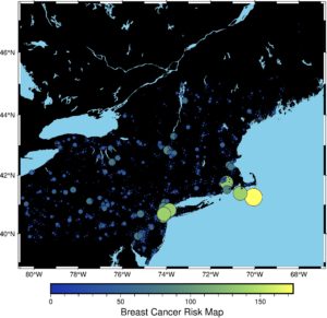
As you see, we have included new methods and new parameters:
- We’ve created a series of values
dsfrom thereg.estcolumn. It simplifies code in the following lines (we can always writedata2[‘reg.est’], but it will be cumbersome). - In the next line, we create a figure and then a colormap to show our data with a different color in relation to the incidence rate value. We use the imola colormap. It is not a random color map – we have chosen it with a purpose. It’s a scientific color map that fairly represents the data, is readable by color-vision and color-blind people and it’s reproducible. More about it you can read here: https://www.fabiocrameri.ch/colourmaps/
- We tune some parameters from the
plotmethod. Now size and color of a circle are dynamic, and we set thecmapparameter toTrueto be sure that points are colored. Additionally, we have added a black border to each circle with thepenparameter. - The color bar is the last, new layer of our map. We added a title too.
This map could be the last. It is better than the map generated with GeoPandas. But we can still work on it, to make it prettier. First, we need to transform data and make it more uniform. We can do it with a logarithmic transform. Then we should take a look into a histogram of changed data.
transformed = np.log(ds + 1)

plt.figure(figsize=(15, 5))
plt.hist(transformed, bins=30, alpha=0.85)
plt.title('Histogram of the breast cancer incidence rate in Northeastern U.S.', size=20, pad=5)
plt.xlabel('Incidence Rate - Breast Cancer', size=12)
plt.show()
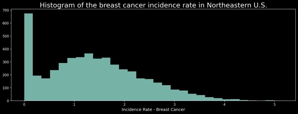
This data has a lot of values that are very close to zero, and those are not so informative for us. That’s why we will remove rates below 0.1 cases per 100 000 people per year from our data, and the histogram will be much more uniform. (Be careful! We can do it for this task; if we consider cancer we are interested in hot-spots and large values, but for other cases you should always consider if it is safe to remove data from the visualization!)
# Remove zeros

transformed = np.log(ds + 1)
transformed[transformed < 0.1] = np.nan

plt.figure(figsize=(15, 5))
plt.hist(transformed, bins=30, alpha=0.85)
plt.title('Histogram of the breast cancer incidence rate in Northeastern U.S.', size=20, pad=5)
plt.xlabel('Incidence Rate - Breast Cancer', size=12)
plt.show()
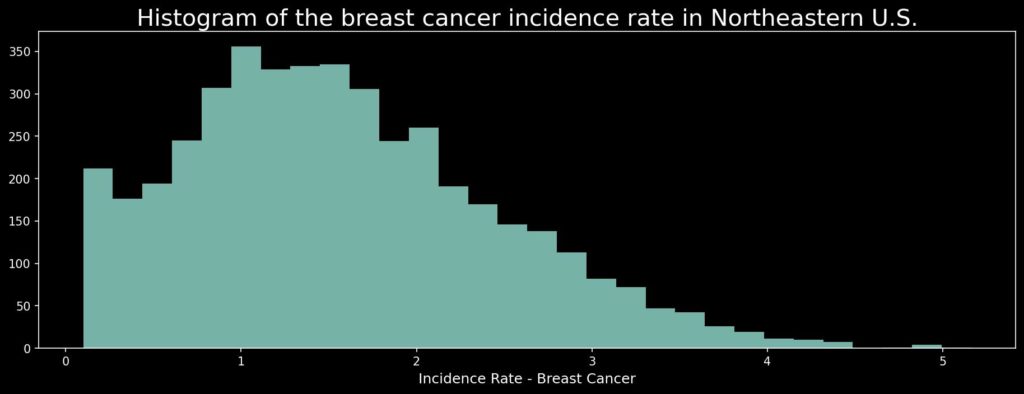
How does our data look now? Let’s check the map!
fig = pygmt.Figure()
pygmt.makecpt(cmap="imola", series=[transformed.min(), transformed.max()])
fig.basemap(region=region, projection="M15c", frame=True)
fig.coast(land="black", water="skyblue")
fig.plot(
    x=data2.geometry.x,
    y=data2.geometry.y,
    size=transformed / 20,
    style="cc",
    color=transformed,
    cmap=True,
    pen="black",
)
fig.colorbar(frame='af+l"Breast Cancer Risk Map - natural log scale"')
fig.show()
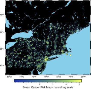
It is much cleaner! Now spatial patterns and clustering are more visible. But it could be better! We’ve transformed input data, so now we will transform the canvas. We will change its colors and add country borders. Additionally, we will add some transparency to the plotted layer:
# Work with the style

fig = pygmt.Figure()
pygmt.makecpt(cmap="imola", series=[transformed.min(), transformed.max()])
fig.basemap(region=region, projection="M15c", frame=True)
fig.coast(land="#F5F5F5", water="#82CAFA", borders='1/1p')
fig.plot(
    x=data2.geometry.x,
    y=data2.geometry.y,
    size=transformed / 20,
    style="cc",
    color=transformed,
    cmap=True,
    pen="black",
    transparency=15
)
fig.colorbar(frame='af+l"Breast Cancer Risk Map - natural log scale"')
fig.show()
We are close to the end! The last thing: we add text layers to map more informative. We add Canada and the Atlantic Ocean names to the map with the text() method and layer.
# Add text

fig = pygmt.Figure()
pygmt.makecpt(cmap="imola", series=[transformed.min(), transformed.max()])
fig.basemap(region=region, projection="M15c", frame=True)
fig.coast(land="#F5F5F5", water="#82CAFA", borders='1/1p')
fig.text(text="CANADA", x=-76.5, y=46, font="18p,Helvetica-Bold")
fig.text(text="ATLANTIC OCEAN", x=-70, y=40)
fig.plot(
    x=data2.geometry.x,
    y=data2.geometry.y,
    size=transformed / 20,
    style="cc",
    color=transformed,
    cmap=True,
    pen="black",
    transparency=15
)
fig.colorbar(frame='af+l"Breast Cancer Risk Map - natural log scale"')
fig.show()
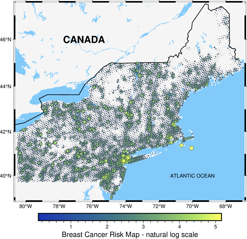
We’ve made it! The final figure is much more readable, and at this stage, we could include it in the report or presentation. If you compare it with the initial map, you’ll see how much we have gained due to the pyGMT. Isn’t it great?
Happy Mapping in 2022!
Resources