Data Science: Unsupervised Classification of satellite images with K-means algorithm
Updates
- 2021-11-30: Added colorbar, correced typos and new function to get a list of spectral indices related to the specific labels from the classification output.
Article Prerequisites:
- K-means clustering technique (https://en.wikipedia.org/wiki/K-means_clustering).
- Python 3.8, numpy (https://numpy.org) and rasterio (https://rasterio.readthedocs.io/en/stable/), scikit-learn, matplotlib and optionally scikit-image.
- Jupyter Notebook (https://jupyter.org) and conda package and environment management system (https://docs.conda.io/en/latest/)
Article Outcomes:
- You will prepare Landsat 8 data as the input for k-means clustering algorithm.
- You perform clustering tasks for different number of clusters and select optimal number of clusters for your analysis.
- You use k-means model inertia and silhouette metrics.
Why do we perform unsupervised classification of the satellite images?
Unsupervised categorization of remotely sensed data seems to be impractical. In truth, supervised classification gives you better results and you know what you’re classifying. Unsupervised algorithms don’t give you that opportunity. Still, there are areas, where unsupervised classification rocks:
- Data compression (instead of thousands of different pixel values you get dozens of them, file size may be much smaller).
- Cloud detection. Scenario is simple, you have scene without clouds, train on it unsupervised classification algorithm and get multiple labels, then you do the same for future scenes and if labels’ borders are not aligned then probably you get a clouds.
- Anomaly detection. Imagine scene without many details (like sea surface). Clusters will be quite large but there are smaller dots – ships – which can be clipped from the image based on the simple statistics.
- Semi-supervised learning. You may have data labeled only partially, then use of k-means on the unlabeled data is the fastest method to label unknown values.
Environment Setup
We use the conda package manager to create a working environment. You should install those packages (from the conda-forge channel):
- numpy
- rasterio
- scikit-learn
- matplotlib
- (optional) scikit-image
To perform this task you need a band set of atmospherically corrected Landsat 8 images. I’ve used scene LC08_L1TP_018030_20190630_20190706_01_T1 which covers the Great Lakes region (Lake Erie, Lake Ontario, Lake Huron) from which I clipped Toronto (CA) area. You may use any other scene, especially images from your area of living!
Data Inspection
It is a good idea to look into a scene before the analysis, and that’s why instead of jumping in the deep end we start with data visualization. We need for it only band 2, band 3 and band 4 of Landsat 8 scene. We will pass more data into the k-means algorithm and visualize scenes in false color so the input dataset consists of bands from 1 to 7. All of them have 30 meters per pixel resolution so we do not need to perform upsampling or downsampling to perform analysis.
Listing 1: Import Python libraries
import os

import numpy as np
import rasterio as rio

from sklearn.cluster import KMeans
from sklearn.metrics import silhouette_score
from skimage.exposure import equalize_adapthist

import matplotlib.pyplot as plt
We import numpy for arrays handling, rasterio for i/o operations related to the remotely sensed data, scikit-learn’s KMeans package for unsupervised classification of pixels, scikit-learn’s silhouette_score function for models evaluation, matplotlib’s pyplot for data visualization. Python’s os library is used for the preparation of the paths to Landsat 8 bands. Scikit-image’s equalize_adapthist function is optional, it is used for visualization of the RGB image. It equalizes the image histogram. I always use it during my analysis because Landsat 8 scenes are dark and it is hard to distinguish details in the RGB image. On the other hand, if you want to start analysis, skip this function. Equalized histograms are not needed by the K-means clustering algorithm.
Listing 2: Load data
path = 'data/'
complete_dataset = os.listdir(path)
complete_dataset = [path + x for x in complete_dataset]
print(complete_dataset)
Output of Listing 2:
['data/clip_RT_LC08_L1TP_018030_20190630_20190706_01_T1_B1.tif',
 'data/clip_RT_LC08_L1TP_018030_20190630_20190706_01_T1_B2.tif',
 'data/clip_RT_LC08_L1TP_018030_20190630_20190706_01_T1_B3.tif',
 'data/clip_RT_LC08_L1TP_018030_20190630_20190706_01_T1_B4.tif',
 'data/clip_RT_LC08_L1TP_018030_20190630_20190706_01_T1_B5.tif',
 'data/clip_RT_LC08_L1TP_018030_20190630_20190706_01_T1_B6.tif',
 'data/clip_RT_LC08_L1TP_018030_20190630_20190706_01_T1_B7.tif']
In my case bands are stored in the 'data/' folder inside the script directory, so you should change the path name if your scene is elsewhere. Pay attention to the fact that the path is relative and if your data is not in your script folder then you should provide the absolute path. With simple list comprehension, we create full paths to each band stored for processing.
You could visualize data directly in your notebook’s cell but I prefer to write functions and classes even for those tedious tasks. You’ll see, that the function used for visualization of the natural color images may be used for visualization of false-color images too.
Listing 3: Function for visualization of image composites.
def show_rgb(bands_list, red=4, green=3, blue=2):
    stack = []

    colors = [red, green, blue]
    colors = ['B' + str(x) for x in colors]

    for color in colors:
        for band in bands_list:
            if color in band:
                with rio.open(band) as src:
                    array = src.read(1)
                    stack.append(array)
                break

    stack = np.dstack(stack)
    for i in range(0, 3):
        stack[:, :, i] = equalize_adapthist(stack[:, :, i], clip_limit=0.025)

    plt.figure(figsize=(15,15))
    plt.axis('off')
    plt.imshow(stack)
    plt.show()

show_rgb(complete_dataset)
Function show_rgb takes a list of all bands and numbers of bands that are related to the red, green and blue layers in our image. For Landsat 8 those are band 4 = red, band 3 = green and band 2 = blue.
Line:
colors = ['B' + str(x) for x in colors]
makes this function useful only for Landsat 8 images because they have substring BXX in the filename, where XX is the number from 1 do 11, for example LC08_L1TP_018030_20190630_20190706_01_T1_B1.tif. If you use other data sources then this function should be rewritten.
We search for each band in a for loop and create a stack from them with numpy’s dstack method. Then each layer of the stack is equalized with equalize_adapthist function. The image may be slightly overexposed, we can control it with the clip_limit parameter. A smaller value of this parameter makes the image darker and some differences between objects will be less visible.

Toronto area has multiple buildings and man-made places and it is hard to distinguish vegetation or other fine details in this brownish image. We can use our function to visualize data with other band combination: 7-6-4. It is designed for man-made objects and enhances them a lot. We pass new red, green and blue argument values to our show_rgb method.
show_rgb(complete_dataset, red=7, green=6, blue=4)
Output image:

You may notice that the main features in this scene are buildings, green areas, water, clouds and cloud shadows (approx. 5 classes of objects). How well K-means algorithm distinguish between different terrain types? We will build a special class to answer that question.
Models Development
To perform K-means classification we need to provide all layers for analysis and the number of clusters that should be detected. There are two lines of code to get classified output.
kmeans = KMeans(n_clusters=number of clusters)
y_pred = kmeans.fit_predict(data stack)
But we cannot use it just like that. The problem is hidden in the number of clusters. It is an unsupervised algorithm and (probably) we don’t know how many classes of terrain type are in our scene. To find out we create a class that will test a range of clusters, store classified images, and training models and their evaluation metrics.
Listing 4: ClusteredBands class – initial structure
class ClusteredBands:

    def __init__(self, rasters_list):
        self.rasters = rasters_list

    def set_raster_stack(self):
        pass

    def build_models(self, no_of_clusters_range):
        pass

    def show_clustered(self):
        pass

    def show_inertia(self):
        pass

    def show_silhouette_scores(self):
        pass
Class ClusteredBands has one parameter with which it is initialized. We pass to it paths to the Landsat 8 tiff files. It could be one band or multiple bands – it is up to you. I choose to pass all 30 meters bands but if you pass fewer layers (as for example bands 4, 3, 2) then your analysis will be faster.
Each empty class method has a purpose but the most important are set_raster_stackand build_models.
set_raster_stack: for development of the raster stack from all bands passed during class initialization,build_models: for building multiple models, one for each range passed in the form of a list. This method will update model, prediction output in the form of classified raster image, inertia value and silhouette score for each range,show_clustered: function which create figure for each output and show it in our notebook,show_inertia: plot of inertia change vs number of ranges,show_silhouette_scores: plot of silhouette score vs number of ranges.
Our class gives us the opportunity to perform full analysis within one object so data is prepared only once with set_raster_stack method and we can evaluate multiple ranges in the build_models method. The class can read GeoTIFF images, then create a layered stack from them. Next, it builds and evaluates models for a given range of clusters. Data processing and model development steps end with output visualization methods.
Data processing is the first step in our analysis, we need to write a method for reading numpy arrays from the bands’ list passed as the initial argument.
Listing 5: ClusteredBands class – set bands stack method
class ClusteredBands:

    def __init__(self, rasters_list):
        self.rasters = rasters_list
        self.model_input = None
        self.width = 0
        self.height = 0
        self.depth = 0

    def set_raster_stack(self):
        band_list = []
        for image in self.rasters:
            with rio.open(image, 'r') as src:
                band = src.read(1)
                band = np.nan_to_num(band)
                band_list.append(band)
        bands_stack = np.dstack(band_list)

        # Prepare model input from bands stack
        self.width, self.height, self.depth = bands_stack.shape
        self.model_input = bands_stack.reshape(self.width * self.height, self.depth)
Method set_raster_stack opens each image and gets numpy array of band values. We must be sure that nan values are converted into numbers, for example 0s, so we use nan_to_num method. Layers for analysis are prepared. We store width, height and depth of band stack, those parameters will be useful later, when we create classified output images. K-means algorithm takes a stack of arrays – we create them with reshape method. Then we store the input dataset in self.model_input parameter.
With prepared data, we can move to the machine learning task! Our method performs K-means clustering for a different number of ranges, then store trained models, their evaluation metrics and classification outputs as model parameters. It will allow us to compare results for a different number of clusters.
Listing 6: ClusteredBands class – models training
class ClusteredBands:

    def __init__(self, rasters_list):
        self.rasters = rasters_list
        self.model_input = None
        self.width = 0
        self.height = 0
        self.depth = 0
        self.no_of_ranges = None
        self.models = None
        self.predicted_rasters = None
        self.s_scores = []
        self.inertia_scores = []

    def build_models(self, no_of_clusters_range):
        self.no_of_ranges = no_of_clusters_range
        models = []
        predicted = []
        inertia_vals = []
        s_scores = []
        for n_clust in no_of_clusters_range:
            kmeans = KMeans(n_clusters=n_clust)
            y_pred = kmeans.fit_predict(self.model_input)

            # Append model
            models.append(kmeans)

            # Calculate metrics
            s_scores.append(self._calc_s_score(y_pred))
            inertia_vals.append(kmeans.inertia_)

            # Append output image (classified)
            quantized_raster = np.reshape(y_pred, (self.width, self.height))
            predicted.append(quantized_raster)

        # Update class parameters
        self.models = models
        self.predicted_rasters = predicted
        self.s_scores = s_scores
        self.inertia_scores = inertia_vals

def _calc_s_score(self, labels):
        s_score = silhouette_score(self.model_input, labels, sample_size=1000)
        return s_score
Argument number_of_clastures_range passed into build_models method must be a list of natural numbers. Our function performs calculations for each range (number of clusters). We automatically get a list of trained models which may be important if you’d like to inspect model hyperparameters. I think that more important are classified rasters because we can inspect what algorithm has produced. Manual inspection is prone to error and we enhance it with model inertia and silhouette score calculated for each range. We write data visualization methods to show output images, plot the inertia and plot the silhouette score. The full code for the ClusteredBands class is relatively long, but half of it is occupied by data visualization methods, so don’t panic!
Listing 7: ClusteredBands class
class ClusteredBands:

    def __init__(self, rasters_list):
        self.rasters = rasters_list
        self.model_input = None
        self.width = 0
        self.height = 0
        self.depth = 0
        self.no_of_ranges = None
        self.models = None
        self.predicted_rasters = None
        self.s_scores = []
        self.inertia_scores = []

    def set_raster_stack(self):
        band_list = []
        for image in self.rasters:
            with rio.open(image, 'r') as src:
                band = src.read(1)
                band = np.nan_to_num(band)
                band_list.append(band)
        bands_stack = np.dstack(band_list)

        # Prepare model input from bands stack
        self.width, self.height, self.depth = bands_stack.shape
        self.model_input = bands_stack.reshape(self.width * self.height, self.depth)

    def build_models(self, no_of_clusters_range):
        self.no_of_ranges = no_of_clusters_range
        models = []
        predicted = []
        inertia_vals = []
        s_scores = []
        for n_clust in no_of_clusters_range:
            kmeans = KMeans(n_clusters=n_clust)
            y_pred = kmeans.fit_predict(self.model_input)

            # Append model
            models.append(kmeans)

            # Calculate metrics
            s_scores.append(self._calc_s_score(y_pred))
            inertia_vals.append(kmeans.inertia_)

            # Append output image (classified)
            quantized_raster = np.reshape(y_pred, (self.width, self.height))
            predicted.append(quantized_raster)

        # Update class parameters
        self.models = models
        self.predicted_rasters = predicted
        self.s_scores = s_scores
        self.inertia_scores = inertia_vals

    def _calc_s_score(self, labels):
        s_score = silhouette_score(self.model_input, labels, sample_size=1000)
        return s_score

    def show_clustered(self):
        for idx, no_of_clust in enumerate(self.no_of_ranges):
            title = 'Number of clusters: ' + str(no_of_clust)
            image = self.predicted_rasters[idx]
            plt.figure(figsize = (15,15))
            plt.axis('off')
            plt.title(title)
            plt.imshow(image, cmap='Accent')
            plt.colorbar()
            plt.show()

    def show_inertia(self):
        plt.figure(figsize = (10,10))
        plt.title('Inertia of the models')
        plt.plot(self.no_of_ranges, self.inertia_scores)
        plt.show()

    def show_silhouette_scores(self):
        plt.figure(figsize = (10,10))
        plt.title('Silhouette scores')
        plt.plot(self.no_of_ranges, self.s_scores)
        plt.show()
We test it and discuss results. First, initialize object with list of bands and then create band stack.
clustered_models = ClusteredBands(complete_dataset)
clustered_models.set_raster_stack()
Set number of ranges and create models. This may take a while.
ranges = np.arange(3, 11, 1)
clustered_models.build_models(ranges)
clustered_models.show_clustered()
clustered_models.show_inertia()
clustered_models.show_silhouette_scores()
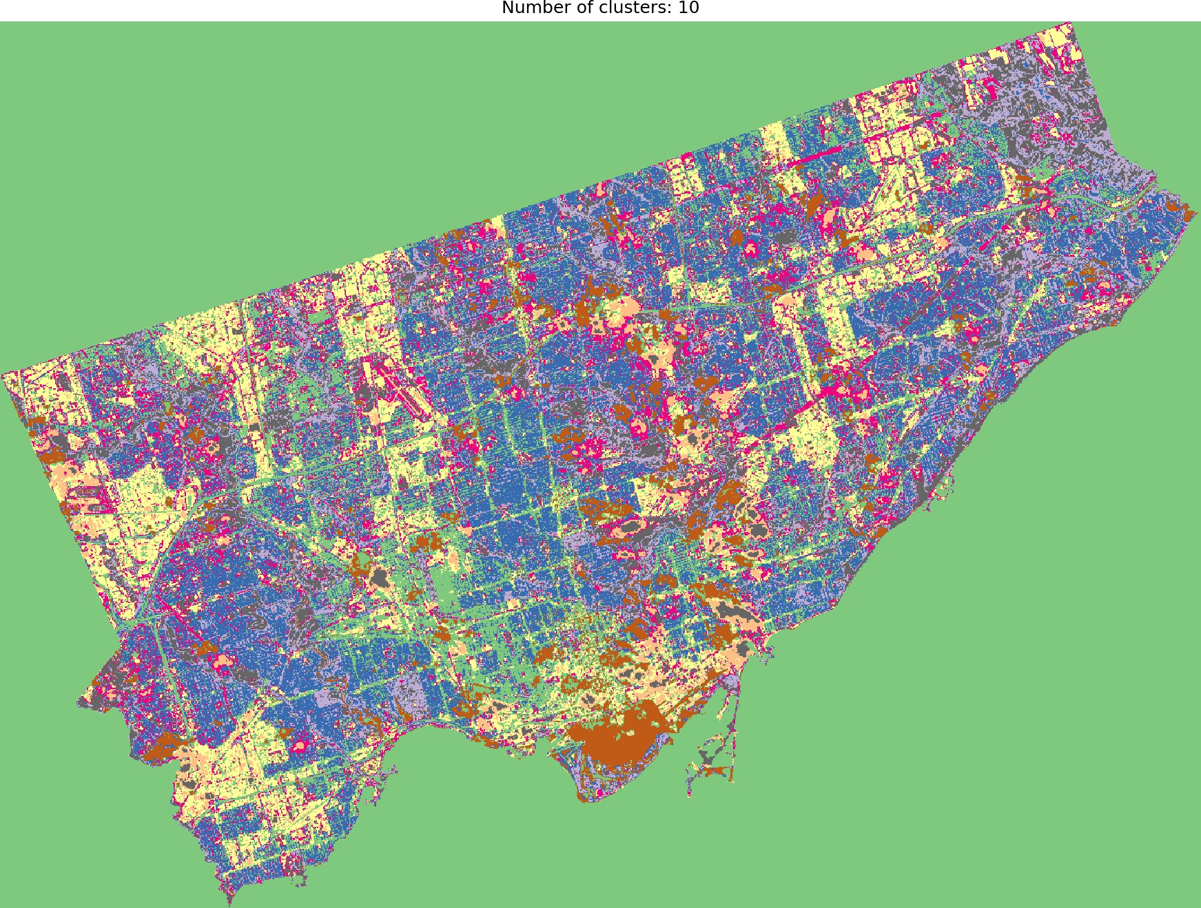
And we are ready to go! Look into outputs for 3, 5, 6 and 10 categories. Which one would you like to use as the foundation of more sophisticated analysis? Which number of ranges is optimal in your opinion?
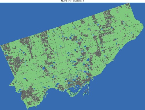
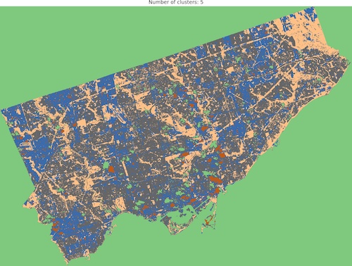
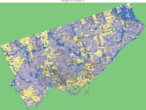

I think that optimal results are for five (5) or six (6) categories. When you compare those images to the RGB scene then it is visible that the main terrain types are presented in the figures. Three (3) categories are not enough to catch spatial variability, a large area of 0’s (NaN’s) is not making it better, it “steals” one label from useful classes. Ten (10) categories create some kind of noise and it is much harder to find out what they are representing when we compare the output image to the RGB scene. So six or five classes give me what I was looking for. It is interesting that for those two categories, the algorithm distinguished clouds and cloud shadows from the scene, which is wonderful.
We can add metrics to our visual inspection. Inertia is one of them. It tells us how far is our sample from its category centroid (in our case it informs how similar is one pixel in all available wavelengths to the class for it was classified). The lowest inertia will be when each position (pixel) of our scene represents its own class but it is not our goal to get the same image as we passed into the algorithm and we want to find a relatively low number of categories which are describing the content of the scene. The trick is to plot change in inertia as a function of a number of categories and find “elbow” in the plotted curve. Elbow represents an optimal range. We can see that elbow is placed at five or six clusters, close to the initial guess from visual inspection.

Finding an elbow is one evaluation method, but it is not ideal. The other is the silhouette score. Scikit-learn calculates silhouette_score metric for the evaluation of algorithms based on distance between predicted categories. The score varies between +1 and -1, the coefficient close to the +1 is good, which means that our pixel is close to its category centroid, coefficient -1 indices that our pixel may be in a wrong cluster. This is a computationally expensive method, that’s why we have set sample_size parameter of silhouette_score method to 1000. If you pass all samples then your algorithm will work extremely slow so beware!
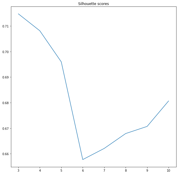
It’s interesting. Silhouette score tells us that optimal models have a low number of categories. We know that three or four classes are not enough to catch variability in the image, so we pick the next lowest value. Five categories should be optimal, visual inspection, inertia and silhouette coefficient tell us that this may be a good choice.
How to get a specific spectral indices for each label?
The solution for this concrete problem is rather simple. Our labeled output image is a numpy array where the specific labels (integers) are located in specific positions. We can check the position of those labels in the array and then we can find spectral indices from the processed bands: we simply take the address of label X and copy this address into the Landsat band. Then we obtain pixel value at this location. We are not going to re-build our ClusteredBands class. Instead, we use an external function that takes two arguments: labeled image and a list of bands. Function returns dictionary with two levels: first key is a raster filename, second level key is a label number and its value is a list of all spectral indices covered by this label:
{raster file: label number: list of the unique spectral indices}Listing 8: Get spectral indices of classification labels from the input bands.
def get_spectral_indices(labeled_image: np.array, rasters: list) -> dict:
    """
    Function creates list of the unique spectral indices for each label from unsupervised classified image.

    :param labeled_image: (numpy array) classification output,
    :param rasters: (list) list of files with Landsat 8 bands.

    :returns: (dict) {raster: {label: [indices]}}
    """
    spectral_indices = {}

    for image in rasters:
        with rio.open(image, 'r') as src:

            band = src.read(1)
            band = np.nan_to_num(band)
            spectral_indices[image] = {}

            for lbl in np.unique(labeled_image):
                indices = band[labeled_image == lbl]
                unique_indices = np.unique(indices)
                spectral_indices[image][lbl] = unique_indices
    return spectral_indices

four_class_spectral_indices = get_spectral_indices(clustered_models.predicted_rasters[1], complete_dataset)
Summary
I hope that this article gives you an idea of how to perform unsupervised clustering of remotely sensed data. If you have any comments or if you are stuck somewhere then write a comment, I’ll answer all your questions.


Hey! Thanks for a great guide — worked perfectly.
One question… How would I actually identify the range of spectral signatures in each category of any given classification model?
Hi Kyla,
It’s great to hear that tutorial was helpful! Do you mean the band values per classification label?
I need to find the value ranges for each cluster in any given model. For example, if I have a model with 9 clusters in it, I want to save each cluster as a variable so that I can store its values and find the ranges from there. I’ve been able to save all the results to a dataframe but was wondering if I could store the clusters themselves as variables. Thanks!
I also was hoping to be able to add a legend to the classification image so that I could see which cluster was which!
Hi Kyla,
sorry that I’m late with the answer, but I was moving between countries, and it took all my free time.
I’ve a solution for you:
def get_spectral_indices(labeled_image: np.array, rasters: list) -> dict:
    """
    Function creates list of the unique spectral indices for each label from unsupervised classified image.

    :param labeled_image: (numpy array) classification output,
    :param rasters: (list) list of files with Landsat 8 bands.

    :returns: (dict) {raster: {label: [indices]}}
    """
    spectral_indices = {}

    for image in rasters:
        with rio.open(image, 'r') as src:

            band = src.read(1)
            band = np.nan_to_num(band)
            spectral_indices[image] = {}

            for lbl in np.unique(labeled_image):
                indices = band[labeled_image == lbl]
                unique_indices = np.unique(indices)
                spectral_indices[image][lbl] = unique_indices
    return spectral_indices
The problem with labels in the image (legend) is more complex than you may think… Fast and dirty solution is to use
plt.colorbar()withinshow_clustered()method. Other solutions are much more complex – I’ll prepare a different note related to this problem.hey!I try this code but the function show_rgb doesn’t work please can you help me
Hi, could you copy & paste error message or – even better – share your notebook? 🙂
Why my image output is black after reading the image and stacking it .I am using landsat 8 satellite images.
Hi! Could you check two things – (1) the dtype of arrays and (2) the min & max value of each layer in a stack?
I am doing all the things but it’s still not working.
Is there any way we can arrange any Google meet?
Sorry, I didn’t have time this year due to the professional reasons and I missed your reply. I’ll take a closer look into this problem next month. Could you provide me scene name that you are processing? I’m interested in the full name with the product level, it will clarify a lot.