
Data Science: Feature Engineering with Spatial Flavour
Imagine that we are working for a real estate agency and our role is to estimate price of apartment renting in a different parts of the New York City. We have obtained multiple features:
- host type,
- host name,
- neighborhood (district name),
- latitude,
- longitude,
- room type,
- minimum nights,
- number of reviews,
- last review date,
- reviews per month,
- calculated host listings count,
- availability 365 days per year (days).
In classic machine learning approach we work through those variables and build model for prediction of a price. If our results are not satisfying we could perform feature engineering tasks to create more inputs for our model:
- multiply features by themself, get logarithms of values or square them,
- perform label or one-hot encoding of categorical variables,
- find some patterns in reviews (sentiment analysis),
- use geographical data and create spatial features.
We will consider the last example and learn how to retrieve spatial information using GeoPandas package and publicly available geographical datasets. We will learn how to:
- Transform spatial data into new variables for ML models.
- Use GeoPandas package along with Pandas to get spatial features from simple tabular readings.
- Retrieve and process freely available spatial data.
Data and environment
Data for this article is shared in Kaggle. It’s AirBnB dataset of apartments’ renting prices in the New York city. You may download it from here: https://www.kaggle.com/dgomonov/new-york-city-airbnb-open-data. Other datasets are shared by the New Your city here: https://www1.nyc.gov/site/planning/data-maps/open-data/districts-download-metadata.page. Data is also available in the blogpost repository. We will be working in Jupyter Notebook and it requires prior conda installation. Main Python packages used in this tutorial are:
- pandas for data wrangling and feature engineering,
- geopandas which works under the hood and allows to process spatial data along with shapely which is installed along with GeoPandas,
- numpy for linear algebra,
- matplotlib and seaborn for data visualization.
First we create new conda environment with desired packages. All steps are presented below. You may copy code to your terminal and everything should go well. Remember that our environment name is airbnb. You may change it in the first step to your own after -n flag.
conda create -n airbnb -c conda-forge pandas geopandas numpy matplotlib seaborn notebook
Then activate environment:
conda activate airbnb
That’s all! Run new notebook with command:
jupyter notebook
Data Exploration
Before we do any processing we take a quick look into our datasets. Core dataset is provided by airbnb. We import all packages for further processing at once:
import numpy as np
import geopandas as gpd
import pandas as pd
import matplotlib.pyplot as plt
import seaborn as sns

from scipy.stats import mstats
from shapely.geometry import Point
Then we set project constants. In our case those are paths to the files and names of special columns:
# Set project constants

baseline_dataset = 'data/AB_NYC_2019.csv'
baseline_id_column = 'id'

boroughs = 'data/nybbwi_20d/nybbwi.shp'
fire_divs = 'data/nyfd_20d/nyfd.shp'
health_cns = 'data/nyhc_20d/nyhc.shp'
police_prs = 'data/nypp_20d/nypp.shp'
school_dis = 'data/nysd_20d/nysd.shp'
The baseline of our work is dataset without any spatial features. Sure, baseline_dataset contains latitude and longitude columns but they are not treated as a single object of a type Point. Instead they’re two floats. This dataset contains hidden spatial information. Columns neighbourhood_group and neighbourhood describe spatial features – administrative units – by their names. The problem is that we don’t know which areas are close to each other, how big they are, if they are close to the specific objects like rivers or sea and so on…
The latitude / longitude description is a data engineering problem and we solve it with simple transformation. Why do we bother? Because spatial computations and spatial joins are much easier with spatial packages where data is stored as a special object named Point. It will be much easier to calculate distance from each apartment to a borough center or to discover within which district is an apartment placed.
Initial step of data exploration is to look into it. We read data with pandas read_csv() method and show sample() of rows from it:
# Read NYC airbnb data and take a look into it

df = pd.read_csv(baseline_dataset,
                 index_col=baseline_id_column)
print(df.sample(3))
Algorithm takes random sample of three rows and notebook shows it for us. Our sample may looks like this:
| id | neighbourhood | … | latitude | longitude | price |
| 34228220 | Hell’s Kitchen | … | 40.75548 | -73.99513 | 225 |
We can use DataFrame.info() method to get better insights what’s going on with data, or DataFrame.describe() to access basic statistical properties of numerical variables. We skip those steps here but article notebook has cells with those methods for the sake of completeness. We then load all spatial datasets and check their properties and perform visual inspection. Shapefiles are read by GeoPandas by geopandas.read_file() method:
# Spatial data sources

gdf_boroughs = gpd.read_file(boroughs)
gdf_fire_divs = gpd.read_file(fire_divs)
gdf_police_prs = gpd.read_file(police_prs)
gdf_school_dis = gpd.read_file(school_dis)
gdf_health_cns = gpd.read_file(health_cns)
When we are working with spatial data it is always a good idea to look into plotted data and check its Coordinate Reference System (CRS). As example for Health Centers districts:
print(gdf_health_cns.info())
print(gdf_health_cns.crs)
base = gdf_boroughs.plot(color='white', edgecolor='black', figsize=(12, 12))
gdf_health_cns.plot(ax=base, color='lightgray', edgecolor='darkgray');
plt.title('School Districts within main boroughs in the New York City.');
<class 'geopandas.geodataframe.GeoDataFrame'>
RangeIndex: 30 entries, 0 to 29
Data columns (total 6 columns):
 #   Column      Non-Null Count  Dtype
---  ------      --------------  -----
 0   BoroCode    30 non-null     int64
 1   BoroName    30 non-null     object
 2   HCentDist   30 non-null     int64
 3   Shape_Leng  30 non-null     float64
 4   Shape_Area  30 non-null     float64
 5   geometry    30 non-null     geometry
dtypes: float64(2), geometry(1), int64(2), object(1)
memory usage: 1.5+ KB
None
epsg:2263
Most important facts about our dataset are that it has:
- 30 entries (30 school districts),
- one column of type
geometrywhich is encoded in theEPSG:2263projection which is designed for the New York State Plane Long Island Zone.
We can plot dataset as a polygon representing administrative boundaries (Figure 1) with GeoPandas geometry.plot() method.
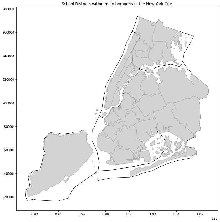
At this moment everything seems to be ok. Thing to remember is that our baseline dataset is not spatial at all and it’s CRS is different than CRS of the read shapefiles. Datasets with latitude / longitude angles are described by EPSG:4326 projection in the most cases. This is projection used by GPS satellites and this is the reason why it is so popular.
Transformation from simple table into spatial dataset
Our dataset has missing values but before we check duplicates and NaNs we will transform geometry from two floats into one Point object. From the engineering point of view we take DataFrame and transform it to the GeoDataFrame. In practice we must create column with geometry attribute and set its projection. Probably most of datasets with point measurements are described by EPSG:4326 projection. But be careful with this hypothesis and always to find and check metadata because you may get strange results if you assign wrong projection to your data.
Before we drop unwanted columns and/or rows with missing values and duplicates we are going to create Points from latitude and longitude columns. Point is a basic data type from shapely package which is used under the hood of Geopandas. Transformation of pair of values into Point is simple. We pass two values to a constructor of Point. As example:
from shapely.geometry import Point

lat = 51.5074
lon = 0.1278

pair = [lon, lat]  # first lon (x) then lat (y)
point = Point(pair)
Then we have to perform this transformation at a scale. We use lambda expression for it and pass into it lat/lon columns to transform them into point. Function below is one solution for our problem:
# Transform geometry

def lat_lon_to_point(dataframe, lon_col='longitude', lat_col='latitude'):
    """Function transform longitude and latitude coordinates into GeoSeries.

    INPUT:

    :param dataframe: DataFrame to be transformed,
    :param lon_col: (str) longitude column name, default is 'longitude',
    :param lat_col: (str) latitude column name, default is 'latitude'.

    OUTPUT:

    :return: (GeoPandas GeoSeries object)
    """

    geometry = dataframe.apply(lambda x: Point([x[lon_col], x[lat_col]]), axis=1)
    geoseries = gpd.GeoSeries(geometry)
    geoseries.name = 'geometry'

    return geoseries
Function returns GeoSeries object. It is similar to Series known from Pandas but it has special properties designed for spatial datasets. GeoSeries has own attributes and methods and it can be compared to Time Series from Pandas. In our case it is just a list of Points. At this moment we can easily append it to our baseline DataFrame.
geometry = lat_lon_to_point(df)
gdf = df.join(geometry)
If we check info about our new dataframe gdf we see that geometry column has special Dtype, even if our gdf is still a classic DataFrame from Pandas!
print(gdf.info())
<class 'pandas.core.frame.DataFrame'>
Int64Index: 48895 entries, 2539 to 36487245
Data columns (total 16 columns):
 #   Column                          Non-Null Count  Dtype
---  ------                          --------------  -----
 0   name                            48879 non-null  object
 1   host_id                         48895 non-null  int64
 2   host_name                       48874 non-null  object
 3   neighbourhood_group             48895 non-null  object
 4   neighbourhood                   48895 non-null  object
 5   latitude                        48895 non-null  float64
 6   longitude                       48895 non-null  float64
 7   room_type                       48895 non-null  object
 8   price                           48895 non-null  int64
 9   minimum_nights                  48895 non-null  int64
 10  number_of_reviews               48895 non-null  int64
 11  last_review                     38843 non-null  object
 12  reviews_per_month               38843 non-null  float64
 13  calculated_host_listings_count  48895 non-null  int64
 14  availability_365                48895 non-null  int64
 15  geometry                        48895 non-null  geometry
dtypes: float64(3), geometry(1), int64(6), object(6)
memory usage: 7.3+ MB
None
Due to the fact that it is DataFrame we are not able to plot map of those points with command gdf['geometry'].plot(). We get TypeError when we try this… In comparison we can plot generated GeoSeries without any problems, GeoPandas engine allows us to do it and command geometry.plot() works fine. We need to transform DataFrame into GeoDataFrame.
Before that we clean data and remove:
- Unwanted columns,
- Rows with missing values,
- Rows with duplicates.
# Leave only wanted columns

gdf = gdf[['neighbourhood_group', 'neighbourhood',
           'room_type', 'price', 'minimum_nights',
           'number_of_reviews','reviews_per_month',
           'calculated_host_listings_count', 'geometry']]

# Drop NaNs
gdf = gdf.dropna(axis=0)

# Drop duplicates
gdf = gdf.drop_duplicates()
Baseline dataset is nearly done! One last thing is to change DataFrame into GeoDataFrame and set projection of the geometry column and we will be ready for the feature engineering. Change DataFrame into GeoDataFrame is very simple. We assign Pandas object into GeoPandas GeoDataFrame. Constructor takes three main arguments: input dataset, geometry column name or geometry array and projection:
gpd.GeoDataFrame(*args, geometry=None, crs=None, **kwargs)
After this operation we are finally able to use spatial processing methods. As example we will be able to plot geometry with GeoPandas engine.
# Transform dataframe into geodataframe

gdf = gpd.GeoDataFrame(gdf, geometry='geometry', crs='EPSG:4326')
# gdf.plot()  # Uncomment if you want to plot data
Extremely important thing to do is a transformation of all projections to a single representation. We use projection from spatial data of New York districts and we are going to transform baseline points with apartments coordinates. GeoDataFrame object allows us to use .to_crs() method to make fast and readable re-projection of data. Very important step before processing of multiple datasets is to check if all projections are the same and if it is True then we can move forward!
# Transform CRS of the baseline GeoDataFrame

gdf.to_crs(crs=gdf_boroughs.crs, inplace=True)

# Check if all crs are the same

print(gdf.crs == gdf_boroughs.crs == gdf_fire_divs.crs == \
     gdf_health_cns.crs == gdf_police_prs.crs == gdf_school_dis.crs)
True
Statistical analysis of the baseline dataset
Maybe you are asking yourself why do we bother? We have many features provided in the initial dataset and probably they are good enough to train a model. We can check it before training by observation of basic statistical properties of variables in relation to price which we would like to predict. We have two simple options:
- observe distribution of price in relation to categorical variables to check if it overlaps frequently,
- check correlation value between numerical features and price.
Categorical features
Categorical columns are:
neighbourhood_group,neighbourhood,- and
room_type.
We can check overlapping between features by analysis of boxplots – but this method is valid only for small datasets. Example is neighbourhood_group with five categories:
def print_nunique(series):
    text = f'Data contains {series.nunique()} unique categories'
    print(text)

# neighbourhood_group

print_nunique(gdf['neighbourhood_group'])
Data contains 5 unique categories
plt.figure(figsize=(6, 10))
sns.boxplot(y='neighbourhood_group', x='price',
            data=gdf, orient='h', showfliers=False)
plt.title('Distribution of price in relation to categorical variables: Boroughs.')
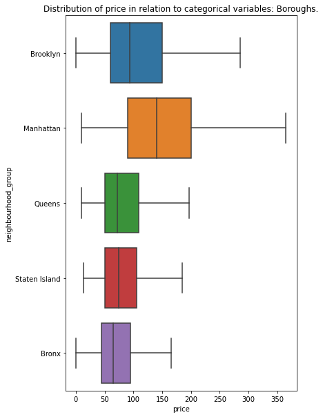
We see that values overlap. They are probably not a good predictors of a renting price – with exclusion of Manhattan area with very high variance. Visual inspection may be misleading and we should perform additional statistical tests (as example Kruskal-Wallis one-way analysis of variance) or train our data on multiple decision trees with different random seeds to see how each category behaves. It is more desired style of work when we compare hundreds of categories… like neighbourhood column. In our case we create function which calculates basic statistics for each unique category and we compare those results (try to make a boxplot of neighbourhood column…)
# neighbourhoods

print_nunique(gdf['neighbourhood'])
Data contains 218 unique categories
# There are too many values to plot them all...

def categorical_distributions(dataframe, categorical_column, numerical_column, dropna=True):
    """
    Function groups data by unique categories and check basic information about
    data distribution per category.

    INPUT:

    :param dataframe: (DataFrame or GeoDataFrame),
    :param categorical_column: (str),
    :param numerical_column: (str),
    :param dropna: (bool) default=True, drops rows with NaN's as index.

    OUTPUT:

    :return: (DataFrame) DataFrame where index represents unique category
        and columns represents: count, mean, median, variance, 1st quantile,
        3rd quantile, skewness and kurtosis.
    """

    cat_df = dataframe[[categorical_column, numerical_column]].copy()

    output_df = pd.DataFrame(index=cat_df[categorical_column].unique())

    # Count
    output_df['count'] = cat_df.groupby(categorical_column).count()

    # Mean
    output_df['mean'] = cat_df.groupby(categorical_column).mean()

    # Variance
    output_df['var'] = cat_df.groupby(categorical_column).std()

    # Median
    output_df['median'] = cat_df.groupby(categorical_column).median()

    # 1st quantile
    output_df['1st_quantile'] = cat_df.groupby(categorical_column).quantile(0.25)

    # 3rd quantile
    output_df['3rd_quantile'] = cat_df.groupby(categorical_column).quantile(0.75)

    # skewness
    output_df['skew'] = cat_df.groupby(categorical_column).skew()

    # kurtosis
    try:
        output_df['kurt'] = cat_df.groupby(categorical_column).apply(pd.Series.kurt)
    except ValueError:
        output_df['kurt'] = cat_df.groupby(categorical_column).apply(pd.Series.kurt)[numerical_column]

    # Dropna

    if dropna:
        output_df = output_df[~output_df.index.isna()]

    return output_df
Based on the grouped statistic we may look into different statistical parameters alone or at all of them and check if there is a high or low level of variability between each category. As example histogram of variance – if it is wide and uniform then we may assume that categorical variables are good predictors. If there are tall and grouped peaks then it could be hard for algorithm to make predictions based only on categorical data.
neigh_dists = categorical_distributions(gdf, 'neighbourhood', 'price')

# Check histogram of variances

plt.figure(figsize=(10, 6))
sns.histplot(neigh_dists['var'], bins=20);
plt.title('Histogram of price variance per category');
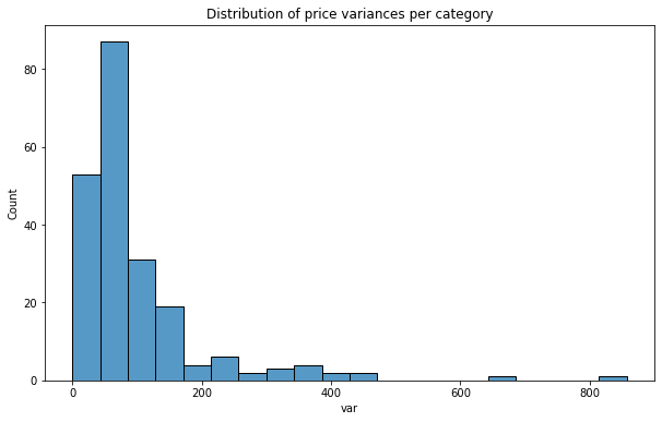
In our case we got something closer to the worst case scenario. Variance of price per neighborhood (Figure 3) has steep peak around low range counts. It has long tail with very small number of counts – some categories could be used for predictions based on their dispersion of values – but there are only few of them. At this stage we can assume that it’ll be hard to train a very good model. Idea of enhancing feature space with new variables has gained better foundation.
Numerical features
How good are our numerical features? One measure of goodness may be correlation between each numerical variable and predicted price. High absolute correlation means that variable is a strong predictor. Correlation close to 0 informs us that there is not relationship between feature and a predicted variable. Method to calculate correlation between columns of DataFrame is provided with Pandas:
print(gdf.corrwith(gdf['price']))
price                             1.000000
minimum_nights                    0.025506
number_of_reviews                -0.035938
reviews_per_month                -0.030608
calculated_host_listings_count    0.052903
dtype: float64
Unfortunately predictors are weak and correlation between price and numerical variables is very weak. This is not something what we would expect from the modeling dataset! Can we make it better?
Spatial Feature Engineering
At this stage we have dataset with AirBnB apartment renting prices in the New York City and five other datasets with spatial features. We do two things in a data engineering pipeline:
- We create a new numerical feature – distance to each borough centroid from the apartment. We assume that this variable covers the fact that location matters in the case of renting prices.
- We create a new categorical features, each for each school district, fire division, police precinct and health center. We perform label encoding with numerical values by taking unique id of each area. Then we calculate within which specific district is our point. The reasoning is the same as for point 1) – we use our knowledge and feed it into algorithm. There is a high chance that hidden variability within schools, health centers, police and fire fighters work is correlated with prices of apartments and model will use this unseen but expected relations.
New numerical features – a distance to borough centroid from each apartment
We have five districts in our dataset: Bronx, Brooklyn, Manhattan, Queens, Staten Island. The idea is to find distance from the centroids of those boroughs to an apartment location. This could be very easily done with GeoPandas methods. One is .centroid which calculates centroid of each geometry in a GeoDataFrame. Other is GeoDataFrame.distance(other). We divide this operations into two cells in Jupyter Notebook. We calculate centroids:
# Get borough centroids

gdf_boroughs['centroids'] = gdf_boroughs.centroid
And we estimate distance to each centroid from each apartment:
# Create n numerical columns
# n = number of boroughs

for bname in gdf_boroughs['BoroName'].unique():
    district_name = 'cdist_' + bname
    cent = gdf_boroughs[gdf_boroughs['BoroName'] == bname]['centroids'].values[0]
    gdf[district_name] = gdf['geometry'].distance(cent)
In the loop above we create a column name with cdist_ prefix and name of a borough. Then we calculate distance (in data units) from borough center to an apartment location. Table 2 is a sample row of the expanded set (only new columns and index are visible):
| id | cdist_Manhattan | cdist_Bronx | cdist_Brooklyn | cdist_Queens | cdist_Staten Island |
| 26424667 | 4718.20 | 43721.71 | 46721.83 | 45085.04 | 86889.10 |
New categorical features – school districts, fire divisions, police precincts and health centers labels
We should go further with spatial feature engineering and we are going to use all available resources. There are multiple school districts or police precincts and calculations of distance from apartment to each of those areas would be not appriopriate because feature space will grow with number of unique districts. Fortunately we can tackle this problem differently. We are going to create new categorical features where we assign unique area id to each apartment. Algorithm is simple. For each district type we perform spatial join of our core set and a new spatial set. It can be done with geopandas.sjoin() method.
# Make a copy of dataframe before any join

ext_gdf = gdf.copy()

# Join Fire Divisions

ext_gdf = gpd.sjoin(ext_gdf, gdf_fire_divs[['geometry', 'FireDiv']], how='left', op='within')
ext_gdf.drop('index_right', axis=1, inplace=True)

# Join Health Centers

ext_gdf = gpd.sjoin(ext_gdf, gdf_health_cns[['geometry', 'HCentDist']], how='left', op='within')
ext_gdf.drop('index_right', axis=1, inplace=True)

# Join Police Precincts

ext_gdf = gpd.sjoin(ext_gdf, gdf_police_prs[['geometry', 'Precinct']], how='left', op='within')
ext_gdf.drop('index_right', axis=1, inplace=True)

# Join School Districts

ext_gdf = gpd.sjoin(ext_gdf, gdf_school_dis[['geometry', 'SchoolDist']], how='left', op='within')
ext_gdf.drop('index_right', axis=1, inplace=True)

# We have to transform categorical columns to be sure that we don't get strange results

categorical_columns = ['FireDiv', 'HCentDist', 'Precinct', 'SchoolDist']
ext_gdf[categorical_columns] = ext_gdf[categorical_columns].astype('category')
Results
Dataset is expanded by nine (9.) new spatial features. Are they worse, better or (approximately) identical to the baseline?
Distribution of categorical features
First we check distribution of price variance per category. We must calculate this with our categorical_distributions() function and then plot them with Seaborn’s histplot().
categorical_columns = ['FireDiv', 'HCentDist', 'Precinct', 'SchoolDist']

for col in categorical_columns:
    distribs = categorical_distributions(ext_gdf, col, 'price')
    dist_var = distribs['var']
    plt.figure(figsize=(10, 6))
    sns.histplot(dist_var, bins=20);
    plt.title(f'Histogram of price variances per category {col}');
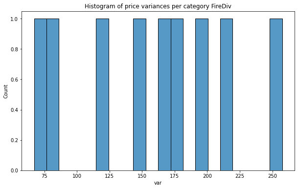
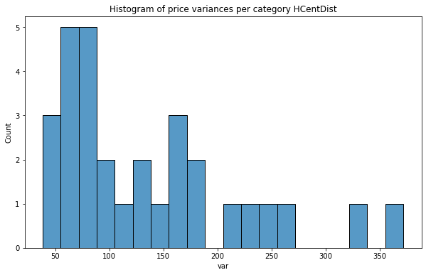
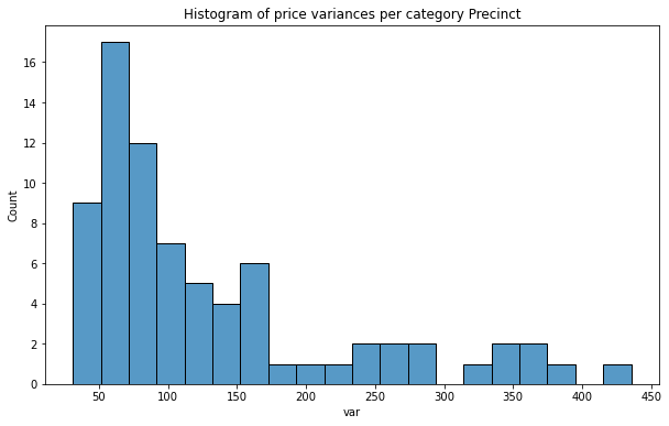
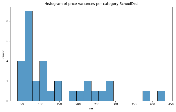
As we see distribution of price variance is very promising, especially for Fire Division units! In each case counts are nearly uniform and we can assume that those predictors will be better than the categories from the baseline set.
Correlation of numerical variables and price
Last step of this tutorial is to check a correlation between numerical variables and price. We run .corrwith() method and look if we get better features:
# Check corr with numerical

ext_gdf.corrwith(ext_gdf['price']).sort_values()
cdist_Manhattan                  -0.146215
cdist_Staten Island              -0.058386
number_of_reviews                -0.035938
reviews_per_month                -0.030608
cdist_Bronx                       0.011228
cdist_Brooklyn                    0.011878
minimum_nights                    0.025506
calculated_host_listings_count    0.052903
cdist_Queens                      0.096206
price                             1.000000
What we get here is really interesting: larger distance from Manhattan is correlated with lower prices and larger distance to Queens is correlated with rising prices. It is reasonable. Distances to Manhattan, Staten Island and Queens are better predictors than for the other numeric values but all predictors are very weak or weak (Manhattan centroid).
Does model be better with those features? Probably yes. We have used publicly available datasets and enhanced baseline dataset with them at nearly zero cost. The next step is to use this data in a real modeling and check how our models behave now!
Exercises:
- Train decision tree regressor on the enhanced dataset. Check which features are the most important for the algorithm.
- Prepare spatial features as in this article and store newly created dataset AND dataset without those spatial features (baseline) where latitude and longitude are floats. Divide indexes into train and test set for both of datasets (they must have the same index!). Train Decision Tree regressor on both sets and compare results.
- As the number 2. but this time generate 10 realizations of train / test set with the new random seed per each realization and train 10 decision trees per dataset with the new random seed per iteration. Aggregate evaluation output – as example Root Mean Squared Error and compare training statistics. (You will generate 10 random train/test splits x 10 random decision tree models x 2 datasets => 100 models per dataset).