Get more from Crime Rate data and other socio-economic indicators with Pyinterpolate
Public data has low quality – probably, we all have heard this truism. But, if we compare data to energy sources, public data is a shale gas reservoir [1]. This formation was known from the XIX century, but we developed techniques to exploit it only three decades ago (in the 1990s). We needed years of research, engineering development, and favorable economic conditions.
We can say the same about aggregated public data sources. Their value is hidden or, specifically, averaged over areas of irregular shapes and sizes. Thus, we need specific techniques for knowledge retrieval. Public data is free and usually open, and we can leverage it in our models without financial burden. Why do we drop it finally? A scale of aggregated datasets rarely fits a scale of other explanatory variables and the response variable, so aggregated data has low quality in real-world applications.
Problem definition
We work for a company that prepares input for a model of a crime risk for a particular region. We have a crime rate map in Poland that is available via public API [2].
It is a vivid choropleth map, eye-catching and self-explanatory. But there are a few problems:
- The bigger counties tend to be more representative than the smaller counties.
- The division between counties is sharp and unnatural.
- Some areas may be over-represented or underrepresented due to the anomalies.
- Uninhabited regions are treated equally to populated spaces.
- A single crime rate is assigned to every household in a county.
We can solve all those problems with additional sampling over a pre-defined sampling grid, which is inconvenient – we know that it is not possible with this data source, counties are fixed, and high-resolution samples are unavailable. However, we have tools to eliminate problems 1, 2, 3, and 4 without much effort. Moreover, we can tackle the fifth issue only if we transform aggregated data into smaller units on a regular grid.
How can we do it? The procedure is simple but not always satisfactory because we may learn that we cannot transform data. (That’s why we will be thorough and won’t skip any steps of analysis and transformation).
Project Requirements
The requirements for this project:
- Python >= 3.8
- Installed packages:
pyinterpolate,geopandas,matplotlib,pandas* - Data that is available here.
* To install them, you can use the conda manager and type:
conda install -c conda-forge pyinterpolate geopandas pandas matplotlib
The procedure
We don’t want to produce garbage. This catastrophic scenario may be avoided if we stick to the procedure of analyzing spatial data. The steps in a sequence are:
- Understand your data. Can it be described as a Poisson process?
- Get fine-resolution data linked to the analyzed variable. In our case, we need to obtain a grid with a population density.
- Check if population data presents spatial dependency – analyze the variogram.
- Transform counts into rates: divide the number of cases by the total population in a county and optionally multiply this ratio by a constant factor. In epidemiological studies, the multiplicative factor is usually 10 000 or 100 000.
- Check if the rates map presents spatial dependency – analyze the variogram.
- Create the initial model of crime rates within a space.
- Iteratively transform this model to include the in-block population point-support.
- Use the transformed model to interpolate new rates at a lower scale.
- Evaluate the modeled high-resolution map to the baseline choropleth map.
- Take more from the analysis: use a variance error map to select locations for additional sampling.
We will follow each step in the article.
Note: Data & Code are available in a GitHub repository HERE.
Understand your data
Public datasets are counts or rates over some areas in a specific time. Let’s consider examples:
- 🦠 COVID incidence rate per country daily,
- 😑 the number of unemployed per state in the last month,
- 🩸 the number of crimes per county in the previous decade,
- 🦁 the count of times when we saw a rare animal in a national park,
- 🛍️ the monthly number of transactions in an e-store,
- 🦟 an annual number of Lyme disease cases in a county,
- 🎣 the number of fish caught monthly in a river.
Every example has a count or rate, a clearly defined area, and a specific sampling period. We can be rather confident that we can work with data presented in the list above. To easily distinguish data that can be processed and data that cannot ask yourself a question:
Do I count something?
Moreover, we can ask if the data follows the Poisson Distribution. Still, if we are getting familiar with statistical distributions, it is better to stick to the counts, time, and a specific setting (location).
Rates, population density grid
Coming back to our analysis… We will use rates instead of counts. Why rates instead of counts? The reason is simple, 400 crimes in a city with 1 000 000 inhabitants have a different weight than 4 crimes in a village with 10 families. Bare counts can be very misleading. That’s why researches have developed weighted metrics of prevalence. Very popular is incidence rate defined for epidemiological studies as:
r=\frac{n}{tot} * cWhere r represents rate, n is the number of people affected in a county, tot is a total population of a county and c is a constant factor of 10 000 or 100 000. We understand it as the number of cases per 100 000 inhabitants (or 10 000). This kind of normalization allows us to compare areas with different population sizes. Using population and rates over counts is a bonus – we can shrink our analysis to population blocks and throw away unreliable representation – and it is the aim of this tutorial.
We get another gain from rate data. It is possible to transform aggregated counts based on the population’s spatial variability, which should give more information than the spatial variability of artificial constructs (counties).
Thus, we need to know if we have population-block data for our area of interest. It is not easy to find it, but most countries share this information. Here are a few examples of population blocks: Poland [3], EU [4], and World [5]. In this article, we will use the Polish dataset. You can work with a different country of your choice and a different dataset than crime rates (maybe you have access to more datasets, or you are interested in something else).
Spatial dependency of population data
This step is optional but could be informative if your analysis goes wrong. We need to manually check if population density can be desribed as a spatial process where close values are more similar than the long range comparisons. We should analyze the variogram. What is the variogram? In short, it is a function of observations dissimilarity with a distance. A valid variogram, or the dissimilarity model, should have a low error at short distances and an error close to the dataset variance at a distance where points don’t influence each other. An example of a variogram that is spatially dependent is presented in the image.
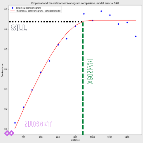
We see that variogram has three parameters:
- Nugget: the initial value at a zero distance, in most cases, it is zero, but sometimes it represents a bias in observations.
- Sill: the point where the semivariogram flattens and reaches approximately 95% of dissimilarity. Sometimes we cannot find a sill; for example, if differences grow exponentially.
- Range: is the distance where a variogram reaches its sill. Larger distances are negligible for interpolation.
We won’t set them manually. The algorithm will do it automatically. If you wish, you may learn more about variogram models HERE, and you will get more control over what you are doing.
For us, the more important fact is that experimental values (blue dots) present a pattern of rising spatial dissimilarity (semivariance) over a distance. Can we say the same about the real-world population data? Let’s code a little bit and check it.
Code Block 1 : URL to Jupyter Notebook with a code
import geopandas as gpd  # The core package for spatial data preprocessing
import pyinterpolate as ptp  # The core package for analysis


points = gpd.read_file('data/population.shp')  # GeoDataFrame

points['x'] = points.geometry.x
points['y'] = points.geometry.y

experimental_var_input = points[['x', 'y', 'TOT']]  # Array for processing


exp_var = ptp.build_experimental_variogram(
    input_array=experimental_var_input,
    step_size=5000,
    max_range=60000
)

exp_var.plot()
The output experimental semivariogram:
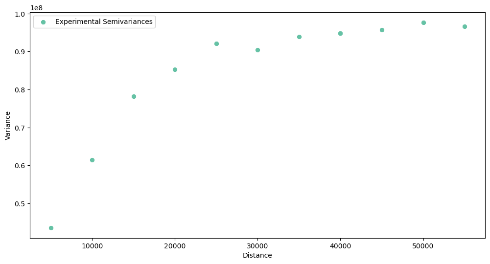
What do we see here? The spatial dependency exists in this dataset, but the curve is rather steep. The range is close to 30 kilometers, and dissimilarity at this distance reaches its sill. Good for us, the semivariogram is not a pure nugget effect (variance doesn’t change with a distance). Thus we continue our analysis.
Explore and transform crime rate counts
We have two data sources: one is a count of crimes in each area, and the second is population density per fine-resolution block-support data (in the following paragraphs, we will assume that our population density blocks are described by their centroids, and we will referrer to them as the point-support).
We know how to calculate rates, and we will do it and compare maps and histograms of raw counts and processed rates. Let’s start with counts.
Code Block 2a : URL to Jupyter Notebook with a code
import geopandas as gpd
import pyinterpolate as ptp

import matplotlib.pyplot as plt


gdf = gpd.read_file('data/crime_rates_2019.shp')

# The "All" column describes all crimes in a county
plt.figure(figsize=(12, 6))
gdf['All'].hist(grid=False, bins=20)
plt.title('Crime counts per county')
plt.show()
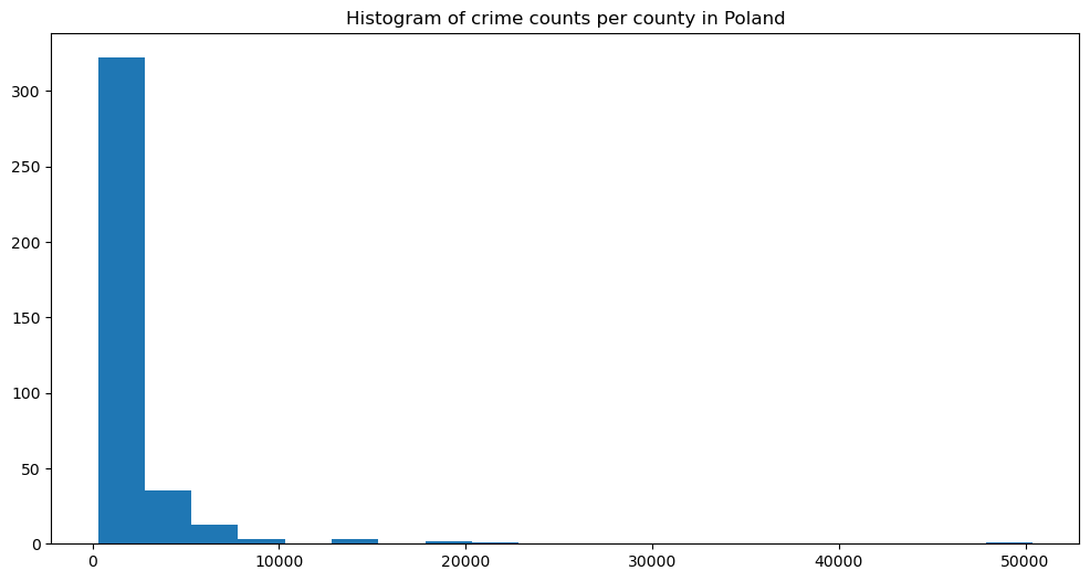
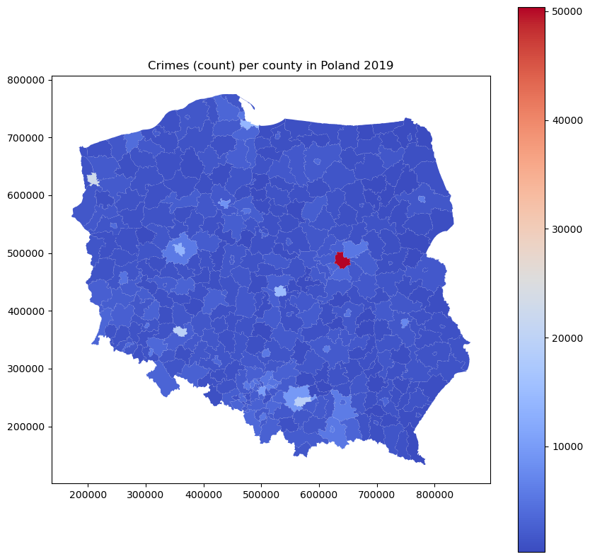
The histogram is highly skewed, with the largest group of low counts and a long tail into large values. It follows the Poisson distribution. The count map is similar and relatively uniform, with one hot spot in the capital. Is it the crime nest for real, or is it just an artifact related to the population in this area?
Code Block 2b : URL to Jupyter Notebook with a code
gdf.plot(figsize=(10, 10), column='All', cmap='coolwarm', legend=True)
plt.title('Crimes (count) per county in Poland 2019')
plt.show()
That it’s just a single artifact. It’s more pronounced when we look into rates instead of counts.
Code Block 2c : URL to Jupyter Notebook with a code
gdf['Crime Rate'] = (gdf['All'] / gdf['Population']) * 100000

gdf.plot(figsize=(10, 10), column='Crime Rate', cmap='coolwarm', legend=True)
plt.title('Crime rates per county in Poland 2019 per 100k inhabitants')
plt.show()
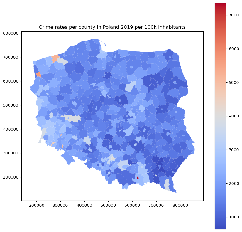
The map shows a different pattern. Now we can observe which cities have the most significant number of crimes per 100 000 inhabitants, and Warsaw is not one of those… The histogram changes too. Its shape is closer to the normal distribution than the Poisson distribution.
Code Block 2d : URL to Jupyter Notebook with a code
plt.figure(figsize=(12, 6))
gdf['Crime Rate'].hist(grid=False, bins=20)
plt.title('Histogram of crime rates per 100 000 inhabitants in Polish counties')
plt.show()
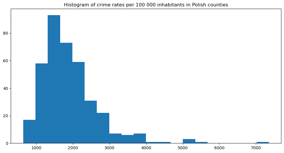
There’s still a long tail towards large values, and in my opinion, 7k crimes per 100k inhabitants (7%) is a lot – this county should be monitored closely by the officials!
Let’s save our transformed data for further processing:
Code Block 2e : URL to Jupyter Notebook with a code
df = gdf[['Crime Rate', 'Population', 'geometry', 'Code']]
df.columns = ['CrimeRate', 'Pop', 'geometry', 'Code']
df.to_file('data/crimerates.shp')
Are rates spatially dependent?
Now we repeat the 3rd analysis step, but this time with block rates. We must check if there is a spatial pattern that may describe the dissimilarity between neighboring areas. We will observe the experimental variogram. First, we will perform a little experiment: we set the step size to 5 km, the same step size as for the point-support semivariogram. The maximum range will be much larger, up to 500 km. What variogram do we get in the result?
Code Block 3a : URL to Jupyter Notebook with a code
import geopandas as gpd
import pyinterpolate as ptp


blocks = ptp.read_block('data/crimerates.shp', val_col_name='CrimeRate')
blocks['x'] = blocks['centroid'].x
blocks['y'] = blocks['centroid'].y
data = blocks[['x', 'y', 'CrimeRate']].values  # x, y, val

# First attempt...

STEP_SIZE = 5_000
MAX_RANGE = 500_000

exp_var = ptp.build_experimental_variogram(input_array=data, step_size=STEP_SIZE, max_range=MAX_RANGE)
exp_var.plot(plot_variance=True)
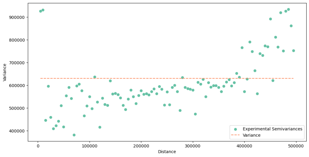
The variogram seems to be wrong! Why is it bad? There is too much noise and variability, especially at a short distance. In the beginning, we see high values. In Poland, the biggest cities are treated as counties, and frequently they are placed within a larger county with a smaller population (polygon within a polygon). After transformation into centroids, we get two points very close to each other: one point with a large population and a crime rate and one point with a low population and a crime rate. This leads to elevated errors (semivariances) between points. We fall into a mirage that the dissimilarity between close neighbors is very high (but it isn’t). This is the problem with sampling: we should avoid a situation when one block is inside the other blocks – their centroids will be very close together or even overlap, but the difference between the city crime rate and the suburban crime rate is usually high in Poland. Our analysis and transformation would be much better if we spent time with data cleaning before modeling.
The other problem is the nugget effect. Look into the y-axis. If you recall the variogram of the point-support, the y-axis has started from a value close to zero. Values on the y-axis of the block semivariogram act differently. It starts from a significant level. What does it mean? That our data is biased. We shouldn’t be surprised because it is a fact related to the data sampling method. Data aggregated over areas of irregular shapes and sizes will be biased. This is the reason why we perform smoothing with Poisson Kriging. The open question is should we introduce the nugget or leave it at zero? We will test both assumptions.
The sharp rising of a variogram around 400 km is another thing worth noticing. We can only guess the reason. Could it be a random effect or a difference between crime rates on the north-eastern or south-western axes of the country? We can assume that the variogram changes its behavior at a large distance, and we will limit the maximum range to exclude this effect.
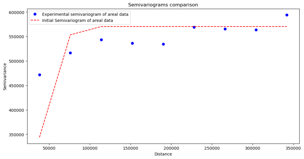
We will set the step size to 38 kilometers, and the maximum range to 380 kilometers.
Code Block 3b : URL to Jupyter Notebook with a code
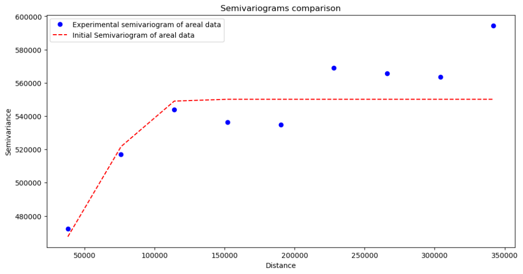
# Second attempt

STEP_SIZE = 38_000
MAX_RANGE = 380_000
exp_var = ptp.build_experimental_variogram(input_array=data, step_size=STEP_SIZE, max_range=MAX_RANGE)
exp_var.plot()
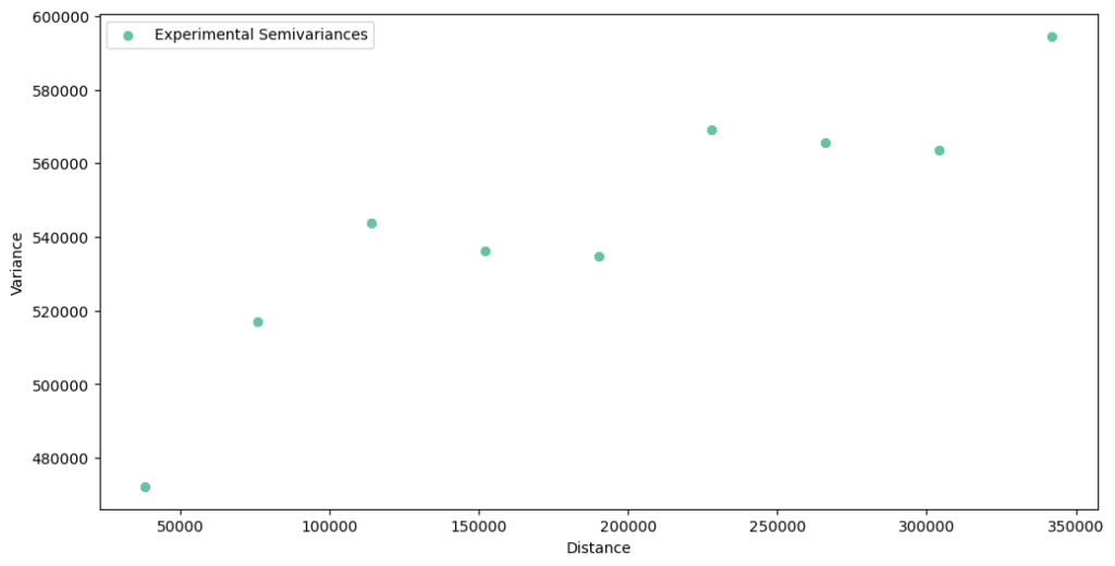
The experimental semivariogram has a lower variance, and we can fit the theoretical model to these points. Unfortunately for us, there are two unanswered problems: the nugget is still here (problem one), and we expect that after the 350 km, we will see a steep rise of a variance (problem two, if you are not convinced, then check it by changing the maximum range to 500 kilometers). We can address the first issue with two variogram models, one with and another without the nugget, and then compare results.
We have reached the point when we should summarize this part of the article. Is data spatially dependent? The experimental variogram tells us that, yes, it is, but dependency is weak. However, there is a high bias at the low distance. We probably didn’t catch the spatial variability at shorter distances than the smallest counties’ size, or it is an artifact from data that wasn’t cleaned perfectly. The steep long-range increase in variance can indicate an additional process or noise. I would bet on the correlation between the economy, infrastructure, and population of the western vs. eastern part of Poland, but it is a long shot. Fortunately for us, the point-support variogram will help us change the behavior of a model at a short distance. Let’s start modeling!
Create the initial regularized model of crime rates
When we decide to move on with the transformation, we must perform two major and computationally intensive operations. Semivariogram regularization is the first operation, and the second is Poisson Kriging itself. Why are those processes so resource-hungry? The most intensive part is a calculation of distances (and semivariances) between point supports. In semivariogram regularization, we calculate semivariance between all points of the point-support within each county and then between counties in a selected range! That’s why we must act wisely. Semivariogram regularization is similar to machine learning model training. We make an initial fit, which is the baseline assumption about data. And then, we transform data in an iterative process. We can check what happened after the initial fit – if it is gibberish, then we stop the algorithm.
We need to define three hyperparameters (there’re more, but we will focus on the basics now):
- step size: we know this one; it is a bin width,
- max range: again, we have defined it before,
- nugget: we didn’t use it but only observed that there might be a nugget effect. We will introduce the nugget of a value 400 000 (variance) to one of the regularized variograms.
It’s straightforward to set a model if we use built-in data structures from Pyinterpolate: Blocks and PointSupport classes. We load polygon aggregates into the Blocks object from a GeoDataFrame and the point-support into the PointSupport class from two shapefiles. You can look up how to do it in the code below.
import geopandas as gpd
import pyinterpolate as ptp


BLOCK_FILE_PATH = 'data/crimerates.shp'
BLOCK_VALUE_COL = 'CrimeRate'
BLOCK_GEOMETRY = 'geometry'
BLOCK_INDEX_COL = 'Code'

POINT_SUPPORT_PATH = 'data/population.shp'
POINT_SUPPORT_VAL_COL = 'TOT'
POINT_SUPPORT_GEOMETRY = 'geometry'

# Blocks
blocks_input = ptp.Blocks()
blocks_input.from_file(fpath=BLOCK_FILE_PATH,
                       value_col=BLOCK_VALUE_COL,
                       geometry_col=BLOCK_GEOMETRY,
                       index_col=BLOCK_INDEX_COL)

# Point support
point_support_input = ptp.PointSupport()
point_support_input.from_files(point_support_data_file=POINT_SUPPORT_PATH,
                               blocks_file=BLOCK_FILE_PATH,
                               point_support_geometry_col=POINT_SUPPORT_GEOMETRY,
                               point_support_val_col=POINT_SUPPORT_VAL_COL,
                               blocks_geometry_col=BLOCK_GEOMETRY,
                               blocks_index_col=BLOCK_INDEX_COL)
We initialize the Deconvolution class that manages the regularization process with Blocks and PointSupport objects. Initialization doesn’t require passing any parameters. We start from the initial fit, and it is a sanity check if we might use aggregated data properties and point support to model data. The .fit() method takes four basic arguments, and one optional – nugget:
agg_dataset:Blocksobject,point_support_dataset:PointSupportobject,agg_step_size: step size derived from the block semivariogram analysis,agg_max_range: the maximum extent of spatial dependency derived from the block semivariogram analysis,- (optional)
agg_nugget: the nugget of a variogram; it has a fixed value (not a range).
Let’s compare two variograms generated with and without nugget after the .fit() method invocation. We use the .plot_variograms() method to check the first iteration results. (Code Listings here show only no-nugget variograms and Poisson Kriging, it is your exercise to perform coding with the fixed nugget).
Code Block 4a : URL to Jupyter Notebook with a code
STEP_SIZE = 38_000
MAX_RANGE = 380_000
NUGGETS = [
    0,
    4 * 10**5
]

# Fit model without nugget

transformer = ptp.Deconvolution()

transformer.fit(agg_dataset=blocks_input,
                point_support_dataset=point_support_input,
                agg_step_size=STEP_SIZE,
                agg_max_range=MAX_RANGE,
                agg_nugget=NUGGETS[0])

transformer.plot_variograms()
Semivariogram without nugget:
This variogram shows that data is biased, and we haven’t caught the process at small distances.
Semivariogram with nugget (set on 400 000):
The variogram fits the data better, but will it be a better model? We will validate it after regularization. Making the variogram “cleaner” has its physical meaning. It isn’t only the hyperparameter tuning. With the nugget > 0, we assume that the spatial dependency has some constant factor (bias). The presented case has its bias introduced by the fact that we have aggregated data, and aggregation blocks have different shapes and sizes. But the wise thing is to test multiple scenarios, with and without the nugget, and then make decisions. We move to the next step, the transformation.
The regularization
The regularization is an iterative process where the aggregated variogram is transformed. The transformation depends on the semivariance of point support inside a block and point supports between neighboring blocks.
The process can be slow. We calculate distances between all points of the point support. If we have a block with 10 points within and another block with 10 points, then we calculate the distance between 10×10 points, that is 100 operations. With 100 points per block, we have 10 000 operations. With 1000 points per block, we have 1 000 000 operations… And it is only for two blocks. We want a satisfactory spatial resolution that fits MODIS pixels – then our computations will be slow. We want to design a solution that works in near real-time for web applications – then we must limit a point support resolution.
Anyway, the transformation or regularization process is programmatically straightforward. We call the .transform() method and set four parameters to control the regularization process:
max_iters: a maximum number of iterations. The default is 25.limit_deviation_ratio: a minimal ratio of model deviation to initial deviation when the algorithm is stopped. The default is 0.1. The parameter compares the error of the i-th iteration to the base error (calculated during the fitting procedure).minimum_deviation_decrease: it is a ratio of the absolute difference between the i-th model error and the best model error divided by the best model error. If it is a tiny fraction, then the algorithm is stopped. The default value is 0.01.reps_deviation_decrese: how many times theminimum_deviation_decreaseshould be counted to stop the algorithm. The default value is 3.
All parameters control the timing when the transformation of regularized variogram is done. Let’s investigate transformation results.
Code Block 4b : URL to Jupyter Notebook with a code
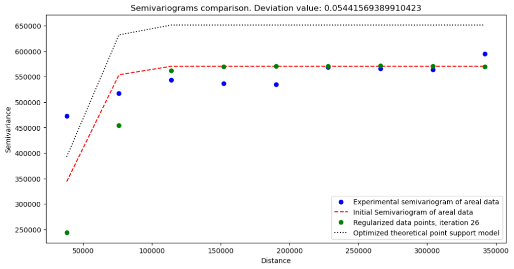
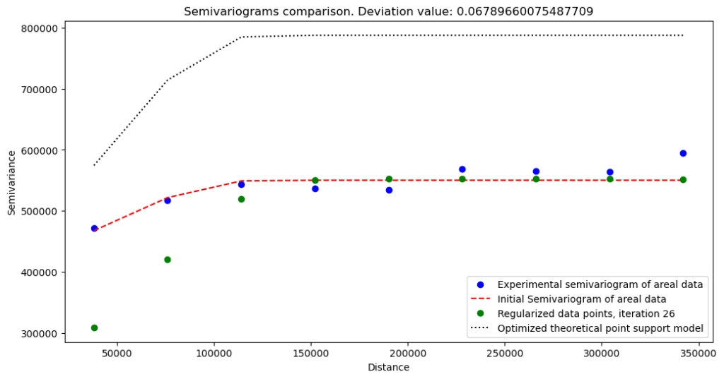
transformer.transform(max_iters=5)

transformer.plot_variograms()
The regularization outputs without nugget:
The regularization outputs with nugget (set on 400 000):
What do we learn from these variograms?
Variogram without nugget has a lower semivariance and a lower sill, but we can expect this behavior. The change at the short distances is abrupt. We see that our data misses short-range variations.
With experimental semivariances, we can start the interpolation procedure. But first, we need to save modeled semivariogram in a JSON file:
Code Block 4c : URL to Jupyter Notebook with a code
transformer.export_model('data/no_nugget_model.json')
Interpolate fine-resolution crime rates
Interpolation is our final step. Semivariogram developed in the last step is the model, but it must be connected to the interpolation algorithm. The operation may be complex if we do it manually, but pyinterpolate was created on real-world projects. Thus it has a high-level function to interpolate missing values from the point-support. We call this function with the smooth_blocks() command. The function takes multiple parameters:
semivariogram_model– our trained / regularized theoretical model as aTheoreticalVariogramobject,blocks– polygon data, aggregated values (rates),point_support– point support data in a concrete type, for example, as aPointSupportobject,number_of_neighbors– the number of adjacent areas that affect the block and its point-support,max_range– maximum range to search for a neighbor,crs– the coordinate reference system of data. If not provided, then it is not set in the outputGeoDataFrame,raise_when_negative_error– Kriging shouldn’t return negative variance errors. If it happens, there is a high chance that we have clustered data, we have chosen the wrong number of neighbors, or we have selected the wrong semivariogram model. The Poisson Kriging is a slow operation. Thus we should carefully consider setting this parameter toTrue. For the comparative runs, it can be set toFalse, and we can select theerr_to_nanparameter toTrue(default), then negative prediction errors are transformed into NaN’s. However, every time when we want to make a decision based on the model, set this parameter to True, and work with data and models up to the moment when no error is raised.err_to_nan– is linked to theraise_when_negative_errorparameter. If we set it toFalseand parameterraise_when_negative_errorisTrue, thenValueErroris raised when a negative variance error is estimated.raise_when_negative_prediction– raisesValueErrorif the predicted value is below zero. The Poisson Kriging process is always positive because it represents counts over a dimension. If we get a negative prediction, our model or sampling grid has a flaw that must be corrected. It is recommended to set this parameter toTrue. Always.
The listing below shows the invocation of the interpolation process. Let’s look into the results. We will plot output with an additional condition where we filter values lower than 1 000 cases per 100 000 inhabitants in a specified point-support block.
Code Block 5a : URL to Jupyter Notebook with a code
import geopandas as gpd
import numpy as np
import pandas as pd

from pyinterpolate import TheoreticalVariogram
from pyinterpolate import Blocks, PointSupport
from pyinterpolate import smooth_blocks


BLOCK_FILE_PATH = 'data/crimerates.shp'
BLOCK_VALUE_COL = 'CrimeRate'
BLOCK_GEOMETRY = 'geometry'
BLOCK_INDEX_COL = 'Code'

POINT_SUPPORT_PATH = 'data/population.shp'
POINT_SUPPORT_VAL_COL = 'TOT'
POINT_SUPPORT_GEOMETRY = 'geometry'

# Blocks
blocks_input = Blocks()
blocks_input.from_file(fpath=BLOCK_FILE_PATH,
                       value_col=BLOCK_VALUE_COL,
                       geometry_col=BLOCK_GEOMETRY,
                       index_col=BLOCK_INDEX_COL)

# Point support
point_support_input = PointSupport()
point_support_input.from_files(point_support_data_file=POINT_SUPPORT_PATH,
                               blocks_file=BLOCK_FILE_PATH,
                               point_support_geometry_col=POINT_SUPPORT_GEOMETRY,
                               point_support_val_col=POINT_SUPPORT_VAL_COL,
                               blocks_geometry_col=BLOCK_GEOMETRY,
                               blocks_index_col=BLOCK_INDEX_COL)

semivariogram = TheoreticalVariogram()
semivariogram.from_json('data/no_nugget_model.json')

# no nugget

NUMBER_OF_NEIGHBORS = 6
MAXIMUM_RANGE = 60_000

smoothed = smooth_blocks(semivariogram_model=semivariogram,
                         blocks=blocks_input,
                         point_support=point_support_input,
                         number_of_neighbors=NUMBER_OF_NEIGHBORS,
                         max_range=MAXIMUM_RANGE,
                         crs=blocks_input.data.crs,
                         raise_when_negative_error=False,
                         raise_when_negative_prediction=True)

# Plot predictions
base = blocks_input.data.plot(figsize=(14, 14), color='white', edgecolor='black', alpha=0.2)
smooth_plot_data = smoothed.copy()
# This line is important if we want to have clear map
smooth_plot_data['pred'][smooth_plot_data['pred'] <= 1000] = np.nan
smooth_plot_data.plot(ax=base, column='pred', cmap='inferno', legend=True, markersize=30)
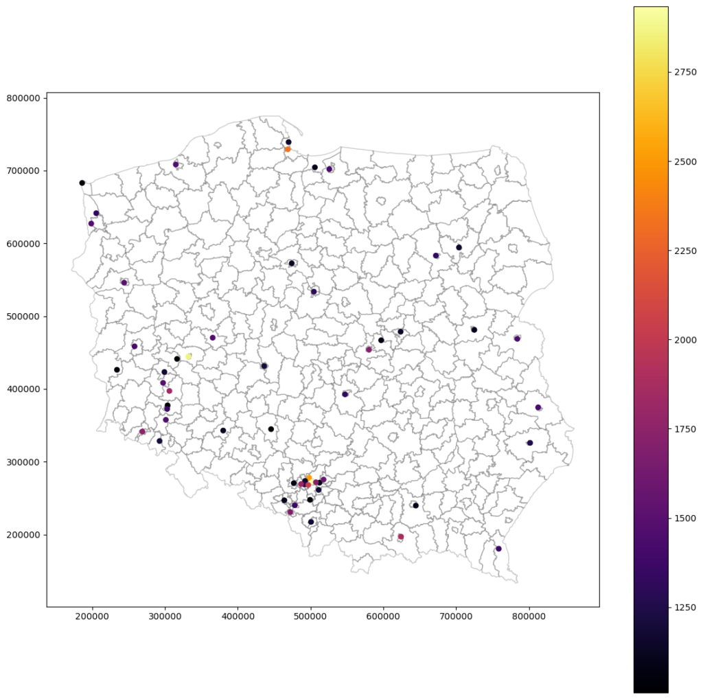
Rescaled and interpolated crime rates without nugget – all values (not clean, the clean below)
Rescaled and interpolated crime rates without nugget – selected values
Rescaled and interpolated crime rates with nugget:
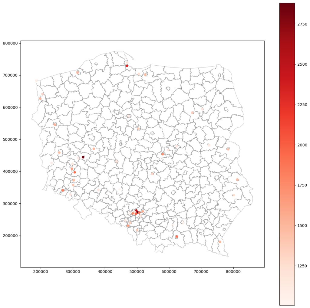
What do we see? That both models are similar. The same points mark the most dangerous places, and most of those points are cities. Even the maximum value is close. With these maps, we can take another step and start working toward crime prevention in selected areas.
Do you remember that our variograms are slightly different? Does it affect the results? Let’s check the difference between no-nugget and nugget maps:
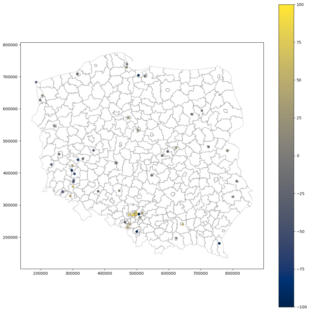
The no-nugget model assigns larger values for clustered areas, like those in a southern-central part of Poland (this region is a densely-populated industrial area). The clusters like that introduce bias and may lead to computational anomalies, and the model without the nugget effect is prone to overestimation in this scenario. The nugget model stabilizes computations for a cluster, and values are slightly lower. Anyway, the difference between results is not prominent. We can assume that models realize two different scenarios that later on can be stacked into distribution maps.
Evaluate models
We have smoothed maps. Now it’s time to evaluate models against the baseline aggregated dataset. We will compute the root mean squared error and forecast bias of aggregated point support predictions. The listing below shos it only for no-nugget model.
Code Block 5b : URL to Jupyter Notebook with a code
grouped_preds = smoothed.groupby('area id')['pred'].sum()
grouped_error = smoothed.groupby('area id')['err'].mean()

grouped = pd.concat([grouped_error, grouped_preds], axis=1)
grouped.index.name = 'Code'

# Load training areas and change column names
core = blocks_input.data[['Code', 'CrimeRate']].copy()
core.set_index('Code', inplace=True)

RMSE = np.sqrt(np.mean((grouped['pred'] - core['CrimeRate'])**2))
f_bias = np.mean(grouped['pred'] - core['CrimeRate'])
| Model | Forecast Bias | RMSE |
| No-nugget | -34.6 | 810 |
| Nugget | -45.5 | 817 |
We learn from the evaluation that our models slightly overestimate county crime rates. The model without the nugget is better, but don’t get attached to it. The differences are slight, and we don’t PREDICT crime rates. We INTERPOLATE. In practice, we should test much more models and build confidence intervals around the expected values of the point-support. However, we can still set arbitrary limits to errors to automatically remove models that deviate too much from a baseline.
The last step is looking into variance error maps (variance uncertainty maps). It is a useful tool to know where we should get more samples to make our model better.
Analyze uncertainty
Variance errors are calculated along the predictions. Do you remember that we have set the parameter controlling algorithm behavior if a negative error occurs? The algorithm always returns a pair of interpolated result and variance error. Now, we are going to use error maps. Those errors are not the same as error metrics from machine learning. The variance error is a measure of variance deviation for a specific point. In Ordinary Kriging of points, we get uncertainty equal to zero in the position of a known point, and it rises with a distance from known locations. This is not an ideal uncertainty estimator because it measures how well data is sampled and structured, but we can use it to decide if some areas need more sampling.
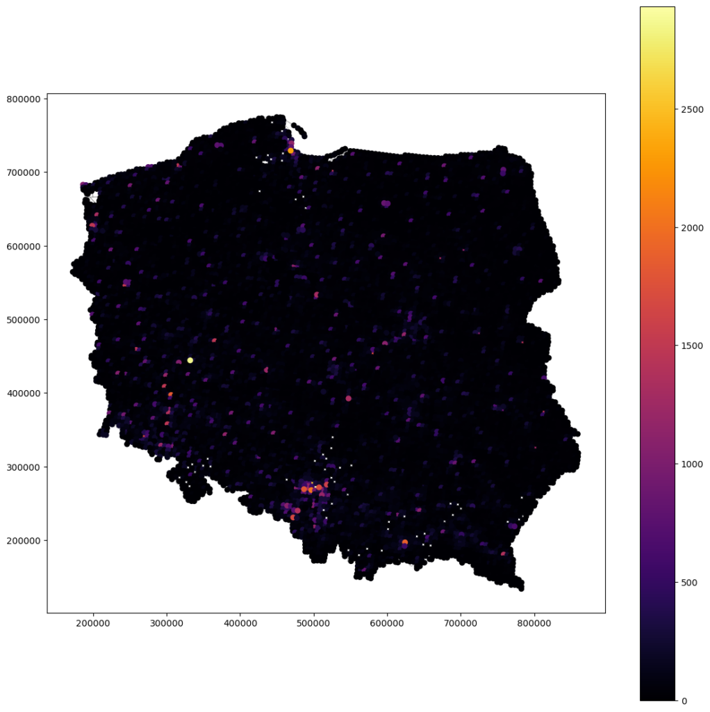
Let’s consider the variance error map of the no-nugget model generated with the code below.
Code Block 5c : URL to Jupyter Notebook with a code
base = blocks_input.data.plot(figsize=(14, 14), color='white', edgecolor='black')
smooth_plot_data = smoothed.copy()
smooth_plot_data.plot(ax=base, column='err', cmap='Reds', legend=True, markersize=30, alpha=0.7)
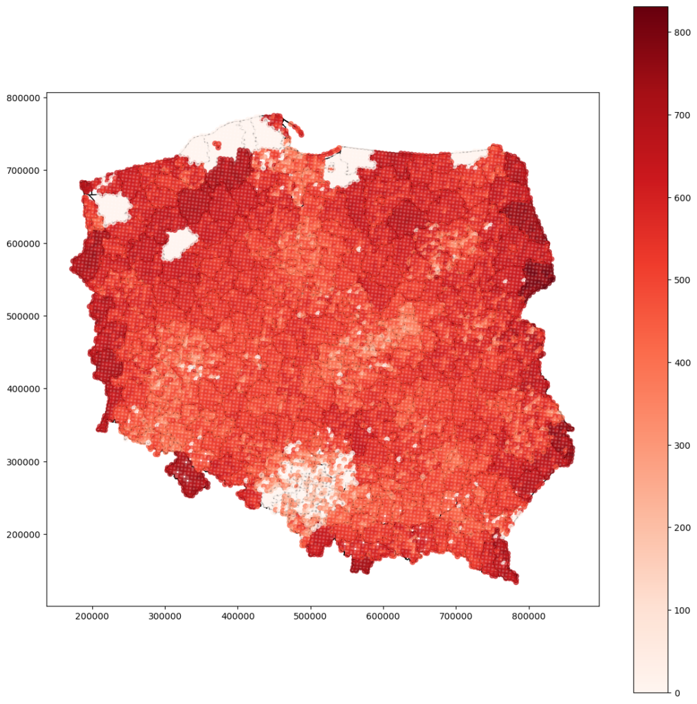
Densely sampled locations in southern Poland have a low variance error. Still, the border regions have higher variance error – we can assume that interpolation in those places is unreliable. Some areas don’t have any values. We can guess that there is an anomaly or some data is left – it should be investigated further in the next model iteration.
Summary
We have to go through each step of the analysis. Now we can iterate again because we have learned more about the underlying process. What can we do to produce a better model:
- Check why there are missing counties,
- Merge counties within other counties into one entity,
- Consider merging small counties that are densely grouped,
- Check more models and more hyperparameters,
- Build interpolation – distribution map instead of fixed values,
- Sample new points.
But we can stop for now and use generated model in our machine learning pipeline. We may use this fine-scaled data with meteorological readings or satellite measurements.
Exercises
- Based on the code listings and the article: fit, transform, and interpolate model with a nugget effect.
- Based on the article, compare differences between both models, but this time analyze regions with less than 1000 crimes per 100 000 inhabitants.
Bibliography
[1] Shale gas reservoir on Wikipedia: https://en.wikipedia.org/wiki/Shale_gas
[2] Crime Rates in Poland dataset: https://bdl.stat.gov.pl/bdl/dane/podgrup/temat
- Select DATA -> Data by areas.
- Category: K37 ORGANIZATION OF THE STATE AND JUSTICE.
- Group: G371 ASCERTAINED CRIMES BY THE POLICE IN COMPLETED PREPARATORY PROCEEDINGS.
- Subgroup: P2290 Ascertained crimes by the Police in completed preparatory proceedings.
- Dimensions: Crimes; Years.
- Last update: 10/11/2022.